When I was first getting started as a web designer one of my first goals was to figure out how to make better websites.
That probably should be the case for every new web designer, right? But, you’d be surprised.
I would often dream of one my sites making it on one of those web design inspiration hubs.
You know what I’m talking about? Sites like awwwards or One Page Love. Those were and still are like the Holy Grail of web designers and developers.
I had one small problem. The websites I was building were pretty bad. Cringeworthy even.
If it was ever going to happen I needed to figure out a way to build websites that were worth the attention. Sites that stood out. Sites that made you pause.
So, I got to work. I started devouring everything I could on mastering my skills.
Books like Daniel Coyle’s “The Talent Code” and Anders Ericcsons “Peak” were on repeat. I was bound and determined to figure things out.
Through all that and through years of practice, I’ve learned some things that have helped me grow as a web designer. AND GOOD NEWS! Eventually one of my sites did make it on one of those fancy inspiration hubs. 😉
So, here’s everything I learned on my journey to make better websites.
What Does it Mean to “Make Better Websites” Anyways?
I feel like before we dive to deep we’ve got to start by defining what it takes to “make better websites.”
After all, better to you, might not mean better to me. The age old “beauty is in the eye of the beholder,” issue.
Plus, often times a lot of the websites that make it on those web design inspiration hubs are a bit self-indulgent. Like they’re more of a hub for web designers to show off their skills to other web designers.
But, thankfully, I think there are some things we can agree on that will bring some objectivity to what we mean when we say “make better websites.”
Community Approval Matters
Have you heard of Mihaly Csikszentmihalyi? His name is a mouthful, but he’s the guy that first coined the phrase “flow” which was popularized in Cal Newport’s book, “Deep Work.”
Mihaly also wrote another book all about creativity.
He makes a claim that in order for a work to be considered truly creative it has to pass through the approval of people in its field. Okay, he didn’t say it that way.
He said: “creativity can be observed only in the interrelations of a system…”
The main idea is in order for something to be heralded as ground breaking you’ll need more than just your mom saying it looks wonderful.
Otherwise, every kids poorly drawn horse would be a masterpiece.
So, in a sense, beauty is not in the eye of the beholder. There needs to be an agreed upon system that evaluates things and sets the standards.
Does that mean that you can’t consider yourself a legit web designer unless one of your sites makes it on Awwwards? No.
But, it does mean you can’t make better websites in a vacuum, all on your own.
You need to submit yourself to a community of people that have some knowledge around the topic and can give you honest feedback.
Purpose Matters
Another thing that’s important if you want to make better websites is trying to align your site with it’s overarching purpose.
Every website you build should have an outcome in mind.
Are you trying to increase product sales?
Are you trying to get more traffic? Keep visitors on for longer?
Your main goal should never be to just make something pretty when there’s a business goal in mind. Reserve those projects when you have some free time.
The main critique I hear about design inspiration sites is that they’re made for designers who are trying to impress other designers. And, in some regard that’s true.
When you dig a little deeper and start actually visiting the sites that get highlighted you start to realize that they’re a UX nightmare.
They’re hard to navigate. They load slowly. All in all, they look pretty but they don’t serve their purpose very well.
If you want to make better websites you’re going to have to think a bit practically and get good at the stuff that isn’t glam and glitter.
Things like UX design, site speed, technical SEO, Google analytics, heck even grammar.
None of those things are super fun to have to wade through. But, they make a difference in the performance of a website.
So, if you’re going to make better websites you’re going to have to get good at the not-so-fun things, too.
It’s not all art and beauty BUT it’s not all databases and number crunching either. Here are a few practical things I’ve learned along the way.
Understand the Individual Components of What Makes a Good Website
A good website is a lot of different disciplines combined all together. It’s not just a website. It’s
- Copywriting
- Branding
- Development
- UX
- Conversion
- SEO
- Graphic Design
And all of the sub components of those things as well.
You could take ANYONE of those elements and find someone that JUST FOCUSES on that, specifically. So, how are you, ONE PERSON, going to become a pro at each?
You’ve got a couple of options.
You could pick one thing you are going to focus on and outsource the others. That’s what a lot of folks do.
AND, to be honest, you’re going to have to if you want to make it to a level where you’re charging upwards of $20k for a website.
The other option is to try and get proficient at each of these components over time. That’s the route I’ve taken for a long time.
You probably need to have a working knowledge of every component of a website if you’re going to make the kind of websites that really stand out. So, it’s not a bad idea to try to have a practical, working knowledge in every area.
1. Don’t Try to Learn Everything All At Once
It’s not a good idea to try and become a top notch copywriter, brand designer, SEO expert, conversion specialist, UX designer, web developer and graphic designer all at once.
Instead, you should think about it in stages. Start with the discipline that you’re most excited about and try to get to a point where you feel really comfortable.
Find some online tutorials. Set aside time every day and just practice that specific area.
I tend to take a good chunk of time and just pour myself into a specific area of a website. So, for 3 months I’m learning everything I can about copywriting. After that, I’m devouring everything I can on conversion rate optimization.
Over time you’ll find yourself getting more and more proficient. Eventually, it’s time to move on to the next area.
2. Use Projects As Your Testing Ground
It’s not enough to just learn these elements of a website and call it a day. You’ve got to apply them to an actual project in order for them to make sense.
I’m a huge fan of using actual projects to learn how to make better websites. In fact, I think it’s probably the only way it’s going to happen.
So, don’t just learn the components without trying to apply them to the bigger context of what you’re trying to do.
You can do that with client sites OR if you don’t have any of those make some test projects. That can also be helpful If you don’t have a big portfolio.
Okay, you know the method to getting proficient in each area. Now, let’s talk about each component individually so you can have a decent idea of what to look for when you’re starting to learn.
Learning Copywriting to Make Better Websites
I dabbled in design before I started building websites. My job for the last 6 years has had the word “designer” in it. BUT, even still, I’ll be the first to admit that copywriting is the most important aspect of a good website.
Good copy is potentially the biggest factor in whether or not a user decides to buy or sign-up. So, you’ve got to get a good grasp on what makes good copy if you want to make better websites.
Do you have to become an all out copywriter? No. But, you will need to get familiar with the core principals of copywriting in order to suss out whether or not a website has the right stuff or not.
I’ve found that good copy is moving, relatable and practical.
How to Make Copy Moving
It’s moving because it gets to the heart of why someone wants to take action in the first place. That might seem simple at first glance BUT the reasons why people decide to do a thing or not do a thing are always a bit more complicated.
For instance, why would someone want to buy a hammer? No one just wants a hammer. Maybe there is a community of hammer collectors out there that I’m unaware of BUT most folks don’t just outright need a hammer.
They want a hammer because they want to put a nail in the wall.
But, you could go even deeper than that. They want a hammer so they can put a nail in the wall so they can hang a picture of their family.
But, you could go even deeper than that. They want to hang a picture of their family on the wall because they want to be reminded that there are people in their lives that they loved and played a key part of their lives.
The real reason they bought that hammer is because they wanted to feel like their lives meant something.
All that from a hammer. Now, you’ve got to be careful because this could really quickly turn to manipulation and people can sniff that out fairly simply.
Don’t just say, “Buy this hammer so your life can matter.” You’ll loose people fairly quickly that way.
But, do try to lean on some underlying motivation they have to take action.
How to Make Copy Relatable
I learned this from one of my friends Davey Jones the CEO of BDOW! is that the main question people have when they come to your website is “Can you do something like that for someone like me?”
In other words, have you made the main point of your site RELATABLE to who they are and what they’re trying to do.
How do you do that?
Well, the first thing you’ve got to do is really understand the type of person who is coming to your website.
What are their fears? What are their hopes? What are their dreams? Where do they shop? What do they do in their freetime?
In a crude sense this is what’s known as a user persona or what some have called an Ideal Customer Avatar.
You need to get into the mind of the people that are potential customers or clients and know how they think.
Another, more practical, way to do this is to take those people’s own words and use it to create your copy.
This is what’s known as Voice of Customer messaging. You take things you’ve heard your customers say by way of interviews, emails or surveys and you use that to create your copy.
That’s one of my favorite things to do. At the end of the day, on your website you’re trying to get little small “yeses” before you get the big “yes, I want to buy.”
One of the best way to do that is use words that your visitors are thinking. As they read them they’ll say, “Yes! That’s exactly what I was thinking.”
How to Make Copy Practical
Finally, you want to make your copy practical. You do this by making a clear statement about what it is you offer and why you’re different.
You’re trying to answer the questions
- Why should I buy this over anything else in the world?
- Why should I buy this over something just like it?
I’ve seen some sites that are really great at being moving but really bad at talking about what they actually do.
So, don’t miss this one.
Another part of being practical is making sure you address the anxieties that people have about signing up or buying.
You do that by adding testimonies or social proof like a “people we’ve worked with” section. But, you also just address the elephant on the website.
The elephant on the website is all the things that people are worried about in the back of their minds. How do you know that? You ask existing customers what their elephants were.
When someone signs up or purchases you ask “What was something that almost held you back from saying yes?”
That one little question will be a wealth of information and can help you create the kind of copy on a website that will ultimately lead to more conversion.
Learning Branding to Make Better Websites
Another key aspect of what it takes to make better websites is getting the branding down.
A lot of times when I ask potential clients if they’ve got their branding squared away they’ll respond by saying, “Yes, we have a logo.” 😂
Unfortunately, a logo doesn’t make a brand. A logo is a small part of what makes up a brand.
A brand in an ethereal sense is how your business makes someone feel. And, it takes more than just a logo to make someone feel something.
It takes colors, images, typography, tone of voice, relationships, story, personality and so many other things that most businesses don’t think about.
So, if you want to make better websites you’ve got to make sure someone has thought through all of those elements and then you’ve got to do a good job reflecting that in the website you’re building.
Let’s talk about a few aspects of branding individually. Assuming someone already has a logo I like to focus on 3 aspects of a brand:
- Typography
- Color Palette
- Images/Graphic Elements
Typography
A lot of times the text or copy on a website makes up a majority of the entire site. Often times there are more words than there are images.
So, you’ve got to make sure that you’ve thought through everything regarding the text. Font choice, font size, variations between headers verses paragraph text, it’s all important and can make a big impact.
There are so many variations of font types.
- Serif
- San Serif
- Handwritten
- Monospace
- Grotesque
- Didone
- Blackletter
- Slab
But, it’s probably smart to keep it simple when you’re first in the process of trying to make better websites. So, let’s narrow it down to Serif, San Serif and Handwritten.
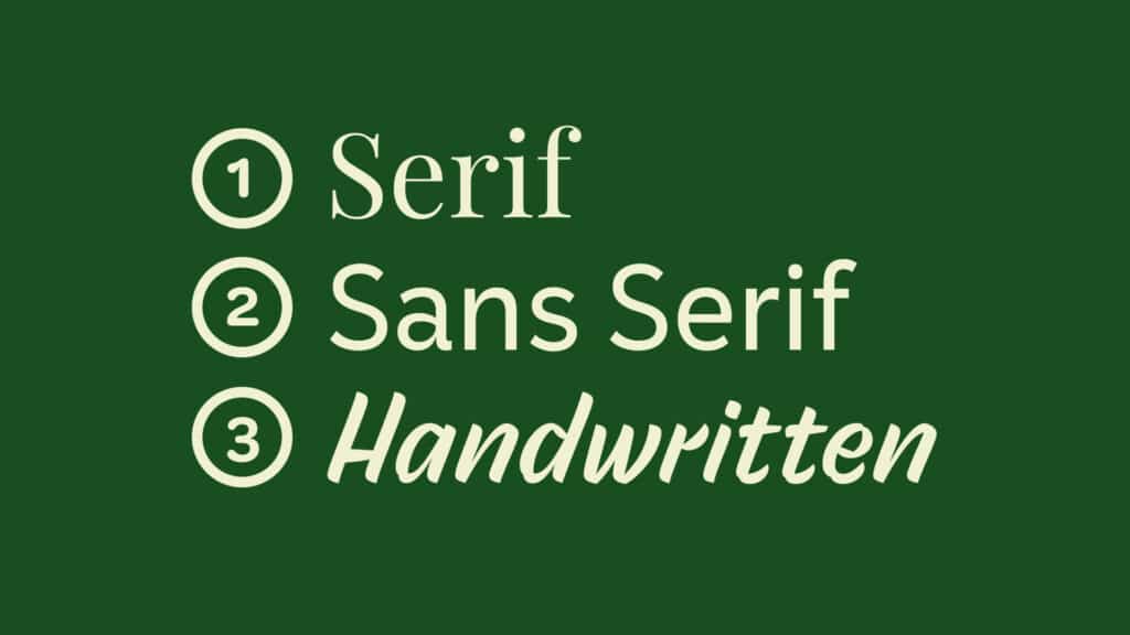
Serif fonts have a more old-timey feel with the little decorative elements on the end of each stroke. Sans Serif fonts are without those little decorative elements hence the name “Sans Serif” or “Without Serif.”
Handwritten fonts are in a league of their own and look like someone…well hand wrote them. It could include more modern handwritten fonts or kick it old school with a more calligraphic feel.
The more you build websites or work on branding the more you’ll start to get familiar with all the different variations. But, don’t let it overwhelm you at first.
Font Combinations
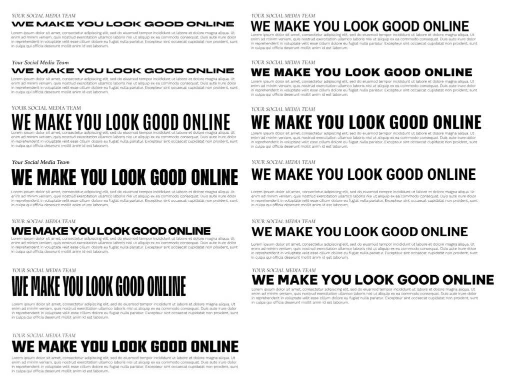
Not only will you have to pick some fonts for your site, you’ll likely need to choose some font combinations.
Text on a website are categorized by the html tags. you might need to have a couple of different types of fonts for each tag depending on the type of branding that’s appropriate for the client, AND they’ll need to have different formats.
Mainly you’ll need to think about differences in:
- Font-Families
- Size
- Case
- Letter Spacing
- Line Height
Not all font combinations need to be drastically different. In fact, the more conservative the brand the better it is to limit things like font-families.
But, you will need to think through things and probably play around with a bunch of options.
I like to put all of my font combo options side by side in an application like Figma. That way I can play around with different settings easily before I make adjustments to my actual website.
Color Palette
The next thing you’ll want to get sufficient at is making or adjusting color palettes. A color palette for a website is all the colors that exist on the site.
It’s typically a series of colors used to add dynamic to any web page.
There are a huge range of options here. From the analogous options or more monochromatic:
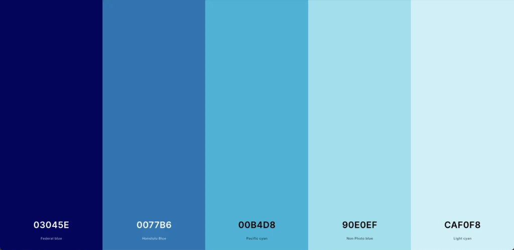
To a more bold option with complimentary colors:
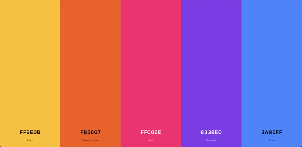
The style you choose will depend greatly on the type of company you’re building a website for.
Monochromatic color palettes can communicate consistency and dependability. While bold complimentary color palettes can communicate fun or creativity.
I use Coolors to help me pick color palette’s. There’s even an option to check color contrast which is a huge factor for colors on websites.
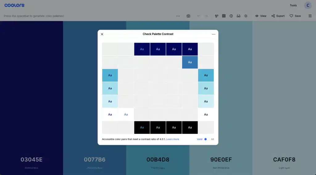
You want to use colors that people with vision problems can still have a fighting chance of seeing.
You can check out more information on accesibility and websites at the Web Aim website.
Images & Graphic Elements
Finally, to make better websites with strong branding you’ve got to get really good at finding and choosing the right images and graphic elements to go on a website.
Sometimes you luck out and the client has a decent set of images from a professional photographer. If they’re a decent brand photographer, they will have had the client where colors that match their branding.
But, often times clients will come to you with really bad photos. The colors will be all wrong. They’ll look like cheesy stock photos. The quality will be bad.
Sometimes they won’t have any photos at all.
So, you’ll have to do the hard work of adjusting the images they have and finding supporting images that go along with them.
I like using photoshop to adjust all of my images. But, get prepared to get really good at things like Gradient Maps, Color Matching and possibly even Generative Fill.
It takes some time to get proficient at taking a photo that doesn’t really match the rest of the website and getting it to fit. But, give it enough time and you’ll start to get proficient at it.
Where to Get Images and Graphic Elements
You’ll also need to get really good at curating images and graphic elements for your projects. For that there are a few places I find myself always visiting.
For images I like to use Pexels and Unsplash.
I tend to visit Pexels first because I like their curation a bit better. But, if I don’t find what I need there I’ll move on to Unsplash.
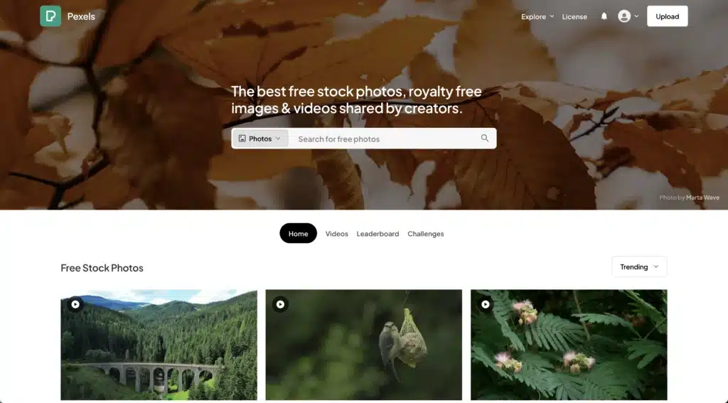
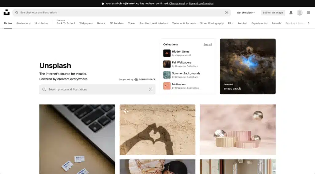
To keep photos all consistent I like to find a photographer that has taken a lot of photos around the same concept and stick with their photographs.
Every photographer is going to have a different editing style AND every photoshoot will have different lighting and colors.
So, you’ll likely get a bunch of different looking images if you just cherry pick photos.
For graphic elements that I don’t make myself I almost always go to Envato Elements to see what they have.
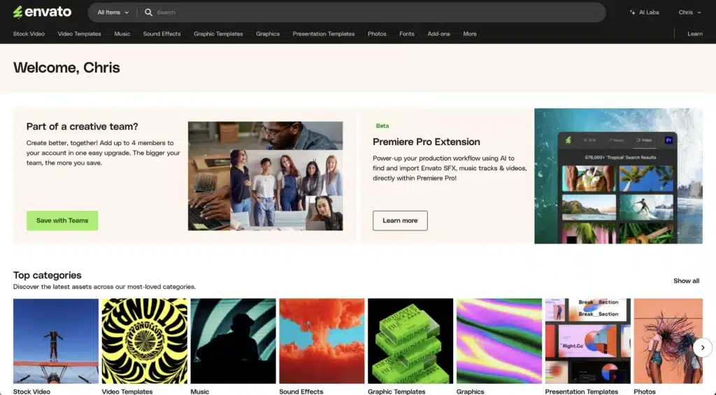
They’ve got loads and loads of fonts, graphics, images even photoshop add-ons to help you with whatever it is that you’re working on.
So, use this resource rather than spending tons of time making this stuff on your own.
It’ll cost you a bit per yer. But, in my opinion, it’s well worth it.
Often times, you’ll have to use your graphic design skills to make adjustments and get it to be exactly what you want it to be for your project. But, guaranteed it will take you less time to do that then build it from scratch.
Improving Your Development Skills to Make Better Websites
Another area to gain some skill so you can make better websites is coding aka development. It’s funny because 10 years ago this would have been the first on the list for building better websites.
You HAD to know code. You had to be decent at it. But, that’s just not the case any more.
You don’t need to know a ton of code to make really cool websites these days. Web builders have come a long way. AND, I know plenty of web designers who are crushing it that go crosseyed when you mention JavaScript.
That being said, the more code you know the more it opens up opportunities for you AND helps you stand out as a web designer.
So, in my opinion, if you want to make better websites, you’ve got to put “learn to code better” on the todo list.
What do you need to know specifically? Well that kind of all depends..
At a bare minimum, you need to be sufficient in HTML and CSS.
HTML & CSS
HTML is like the framework of every website. It’s the structure. The bones so to speak. But, HTML without CSS looks bad.
It looks like what the internet was first envisioned to be: a database of documents that could be shared quickly and easily so you didn’t have to print things out and fax them.
BUT, that all changed with the introduction of CSS.
CSS takes the structure and adds some finesse to it. It makes things prettier.
What was once just barebones online document can now become a beautiful website that’s fun to look at.
JavaScript
Then there’s JavaScript. JavaScript is the language used to handle all the actions a user might take on a website. So, things like clicks, scrolls, hover.
Now, for sure it can do way more that just handle user actions, BUT, for the purposes of this article, that’s a great place to start.
JavaScript is what people use to make super fun animations and is an important language to get familiar with if you really want your websites to stand out.
Thankfully, there are a ton of great JavaScript libraries out there so you don’t have to build things from scratch.
GSAP is a JavaScript animation library that I find myself gravitating toward super often. With just a few lines of code I can make some really cool effects on my websites.
PHP
If you’re a WordPress fan like myself then you’ll also want to get familiar with some PHP. That’s the language that majority of WordPress was built on.
Recently, they’ve started to add some JavaScript in the form of React. But, PHP is still and will likely always be a mainstay.
You don’t necessarily need to know all the in’s and out’s of PHP to make better websites. BUT, you will need to know some basic syntax.
And, maybe more importantly, you’re going to need to get really familiar with some WordPress functions.
WordPress has it’s own very in-depth documentation known as the WordPress Codex. You’ll need to get decent at navigating through the documentation and learning how to interpret it.
You don’t need to have it memorized by any means. In fact, if you know just a few things like specific actions or hooks then you’ll be well on your way.
How to Learn Code to Make Better Websites
I’m a huge proponent of using projects to learn how to code. In fact, it’s really tough to truly understand what you’re doing with code unless it’s attached to some big picture goal.
So, try to do something you’ve never done before on every project you work on.
BUT, you will need to have a basic level of understanding before you get started. For that, I’d turn to platforms like Codecademy or The Odin Project.
Using UX to Make Better Websites
UX or User Experience is a fairly recent discipline in the world of website building. The discipline itself has been around since people have been making stuff.
But, it wasn’t until the last 10 years or so that people have really started to make efforts to prioritize UX for the world of websites and online applications.
At it’s most basic level, UX is simply the intention people put around making a website easier to use the way it’s supposed to be used.
Everett McKay, the author of “Intuitive Design” called UX the invisible user manual.
Long ago when dinosaurs roamed the land, you’d get these really thick books with every computer you bought and every software you tried adding to it.
Those books would detail out how to use the devices and software in a pretty in-depth way. If you had questions you’d just crack open this huge encyclopedia of computer information and skim your little heart out until you finally found what you were looking for…and a lot of times you never actually found what you were looking for. 😂
Eventually, companies realized that if people had to get a bachelors degree just to use their software they likely weren’t going to buy it at all. So, they went about the work of making things much more simple to use.
That was the birthplace of UX for the internet.
What You Need to Know About UX for Websites
You don’t need to know everything there is about UX to make better websites. But, you do need to have a decent understanding of a few things.
Specifically:
- User Persona
- User Journey
- Accessibility
- User Testing
User Persona
User persona has to do with the type of person that’s visiting your website down to the specifics of what types of products they buy and where they like to get their coffee.
When you understand user persona you have a better understanding of how to give your website visitors what they’re really looking for.
One of the things I had to really train myself in was thinking about the website from the visitors perspective.
After all, you’re not making the website for yourself. You’re making it for the folks that find you on the internet.
So, what are they looking for? What inspires them? How can you lay things out in such a way that it keeps them interested?
All of those questions become much easier to answer when you’ve got a really solid grasp on the type of person doing the scrolling.
User Journey
Once you’ve got the user persona down, you’ve got to start thinking about the journey they’re going to take when they visit your website.
Like I mentioned previously, if you want to make better websites you’ve got to get good at figuring out what you want the user to do as a result of visiting your site.
In other words, it needs to have an outcome in mind. A user journey starts with the outcome and then works backward.
So, if we want people to buy our product we’ve got to start thinking from the “your sale has been finalized” page and go back through time.
How was the checkout process? Did it take a long time?
Go back even further.
How was the product page? Did it answer all of their questions? Was it tough to add an item to the cart? Did they know where to go once they added that item to the cart?
You keep going back until you reach the point that someone landed on your website in the first place. But, don’t stop there!
What were they doing before they made it to your site? Were they browsing the internet and had a random question? Where they looking for something specifically?
All of the answers to those questions will determine what you do in designing the user journey AND will help you make better websites.
Accessibility
Accessibility in web design has to do with how easy or difficult a website might be for someone with disabilities to navigate.
Accessibility could be an article unto itself. But, there are a few heavy hitters I find myself focusing on.
- Color contrast
- Alt tags
- Sizes
I mentioned the coolors color contrast checker BUT the idea behind is that what you’re looking for is a contrast ratio between light and dark colors of 7:1.
It can be less on bigger text, but, in general, that’s what you want to shoot for.
The Web Aim Contrast Checker is another great resource in case you’re wondering about a specific combo.
Alt Tags are a parameter on an image html element that describes what the picture is with text.
The purpose is to give screen readers something to say whenever there’s an image on a website. So, for folks that might have a difficult time seeing, they don’t miss out on what’s happening on the page.
Text Size
For sizes, you want to think about someone that might have difficulty seeing or even interacting with a website. So, is the text too small? Are the buttons tough to click on a mobile device?
I try to go no smaller than a 16 pixel font on text. That could vary depending on the font. Some fonts are wider at smaller sizes and might be tough to get on the screen.
But, I can’t think of a website where I’ve gone smaller than 16 pixels.
You don’t want to go smaller than 44 pixels high and 44 pixels wide for buttons sizes.
There might be scenarios that those rules can be bent. But, the aim should be to stay in that ballpark.
Again, accessibility is a big and important topic. You definitely want to take some time studying up on everything you should consider in order to make better websites.
User Testing
Nothing will help you find weak spots in your UX like having someone sit down on your website and test it out. User testing should be the backbone of all UX decisions.
It’s impossible to make the best decisions for your website by just sitting down and trying to think of the best thing to do. Sure, that might get you close. If you’ve been doing web design long enough it might get you REALLY close.
But, there are just some things that you won’t be able to figure out until you ask someone else to do something specific on the project your working on.
Steve Krug is like one of the founding fathers of UX and I love his book, “Rocket Surgery Made Easy” when it comes to UX. He has a really simple approach that’s super doable no matter what project it is or what your budget is.
Questions to Ask for User Testing
Basically, you have someone sit down on your website and, first, you ask them to scroll around a little bit and explain what they think the purpose of the website is.
Make sure they don’t click any links. All their doing is scrolling.
That first question alone will help you know how well you’ve done at communicating the big picture idea of your website to it’s audience.
I remember one website I was working on that we decided to put some recognizable people that used the site’s product at the very top of the page. Our whole idea was if people saw someone they looked up to at the very top of the page they’d be more likely to buy the product.
I asked that question (what’s the purpose of this website) and the response I got was, “Oh this is a website for that lady at the top left that looks like an influencer.”
Nope. Not even close.
It was at that point I knew I had to go back to the drawing board.
From there I would give the users a few tasks they’d have to do like buying a product or signing up for a free trial. I’d ask them to talk out loud about what they were thinking and record the whole thing.
There isn’t a single time I’ve done this that I haven’t gotten some super valuable insight that helped us make better websites.
Learning Conversion to Make Better Websites
What good is a website if it doesn’t get people to do what you’re hoping they’ll do when they visit? This is a lesson I unfortunately learned the hard way.
I built a beautiful website for a client. It was wayyyyy better than there last website. Unfortunately, the clients sales absolutely tanked when we launched the site.
It was at that point I sarealized that pretty websites don’t always equal a better solution for a client. The way it looks is important but not as important as good conversion principles.
Really the most important aspect of conversion is copy. Good copy will go a long way in convincing someone to do the thing you’re trying to get them to do.
So, your well on your way to a high converting website if you get decent at either writing or recognizing good copy.
But, there are a few other things you want to do to optimize your website for conversion. Or what’s known as conversion rate optimization.
Specifically, you want to get familiar with:
- Understanding the analytics of your website
- Finding a way to create fomo
- Giving convincing social proof
- Testing out different things to optimize what you’ve got
Let’s talk about each of these for a second.
Analytics
Getting good at analytics is essential to what it takes to make better websites. The biggest name in the Analytics game is Google Analytics.
It all starts by creating a property in the Google Analytics Dashboard. You go to your admin settings then hit create a property.
From there you answer a series of questions about your business. Eventually, you’ll get what’s known as a property ID.
A lot of website builders will have the ability to add your property ID straight into the builder itself. But, if not, you can take a snippet from google analytics and add it to the code in your website.
The Main Two Things Analytics Will Help With
The main two questions that analytics will help you answer is where are people coming from when they land on your website AND what are they doing when they get there.
The two places you find answers to those questions are in Acquisition and Engagement.
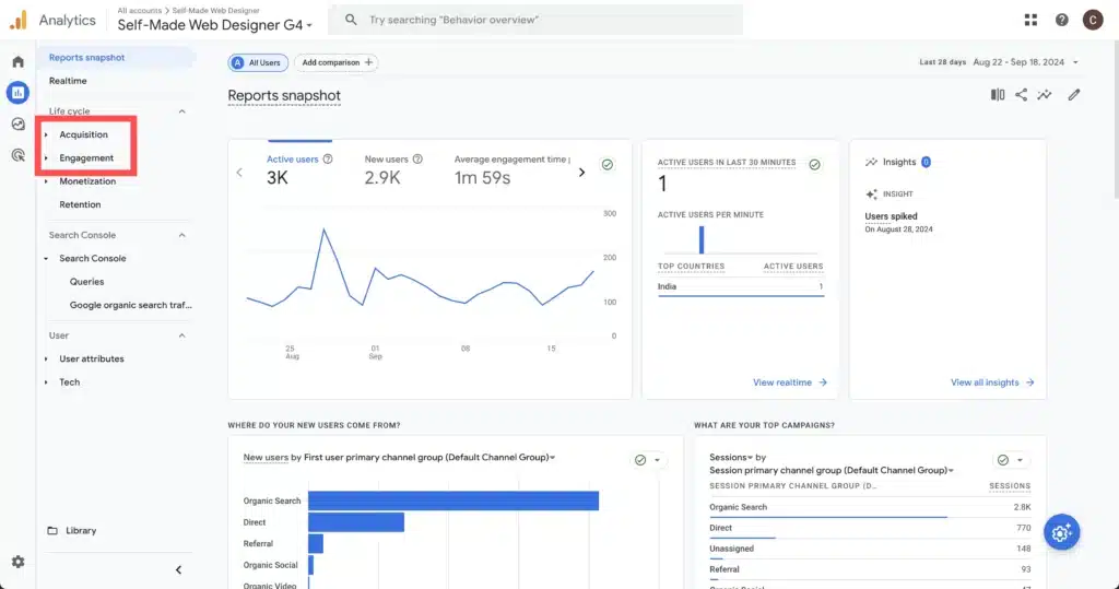
The answers to those questions can make a HUGE difference in the success of a website.
If you know where your traffic is coming from you’ve got a hint on what you can do to increase your traffic. For instance, on this website (self-made web designer) I started noticing that hardly ANY of my traffic was coming through social media despite me putting a lot of effort into social.
BUT, there was an increasing amount of traffic coming through SEO. So, I throttled up the SEO and throttled back the social media.
Once they land on your website it’s helpful to know what they’re doing.
Are they staying there for a while or leaving? What buttons are they clicking? How far are they scrolling?
All of that information will help you know whether or not the website you’ve built is good at what it’s supposed to do. If it’s not, you can try some different things out. If it is, what can you do to make it better?
FOMO
FOMO or fear of missing out is one of the best conversion tools out there. Essentially, you’re trying to create a sense of urgency when someone’s making a decision.
You really want the answer a user gives you when they visit your site to be either “yes” or “no.” A “maybe” means you might not have done the best job being convincing them.
Now, sometimes a “maybe” is reasonable especially if the commitment they have to make is really big.
But, really, the bigger the commitment the more you need to increase the FOMO.
It’s helpful to phrase this with a question: “Why should someone say yes now verses tomorrow?”
Is there a deal they might miss out on? Do you have limited availability? Are there bonuses they might not have access to anymore.
Think about the online stores you visit and how they’ll give you a limited time discount if you buy in 24 hours.
That’s FOMO and that’s great for conversion.
Some people will say, “But I don’t want to cheapen the value of my product by giving a discount.”
Fair. Maybe you’re trying to be known as a high value solution. Discounting your products might ruin that idea.
So, instead of discounting, give limited time bonuses. Throw in a few other products to sweeten the deal.
Just do what you can to make sure they know they want your product before they leave your website.
Social Proof
Humans are pack animals. We like being in communities. We trust things more when people in our communities have tried something out and can share their experience.
So, you HAVE to include a decent amount of social proof if you want to make better websites by improving conversion.
What is social proof? It’s signals to the user that other people can vouch for the product or service.
It comes in the form of things like testimonies, clients we’ve worked with, featured on sections or customer ratings.
The main thing people want to know is they aren’t alone in their decision. If you get something like that up on the website you’re 70% there.
But, if you can go even further and address people’s concerns WITHIN the social proof it’s even better.
So, having testimonies like, “I was worried about buying this product but then…” are worth their weight in gold.
You also want to get testimonies that are super specific.
A testimony that says “This product really helped me out,” isn’t nearly as helpful as “Three days after I bought this product I was able to save $3,000 a year on my health insurance.”
A/B Testing
Finally, an important aspect of conversion rate optimization is A/B testing.
A/B testing is serving up different versions of the same web page to different people that visit a site and then seeing which version performs better.
So, for example, one version of a website you might be testing has a button that says “sign up today” and that same button on another version just says, “sign up.” You run a test for a couple of weeks and see which button got clicked the most by users.
There are a ton of great ways to do something like that BUT my favorite is through a platform called VWO.
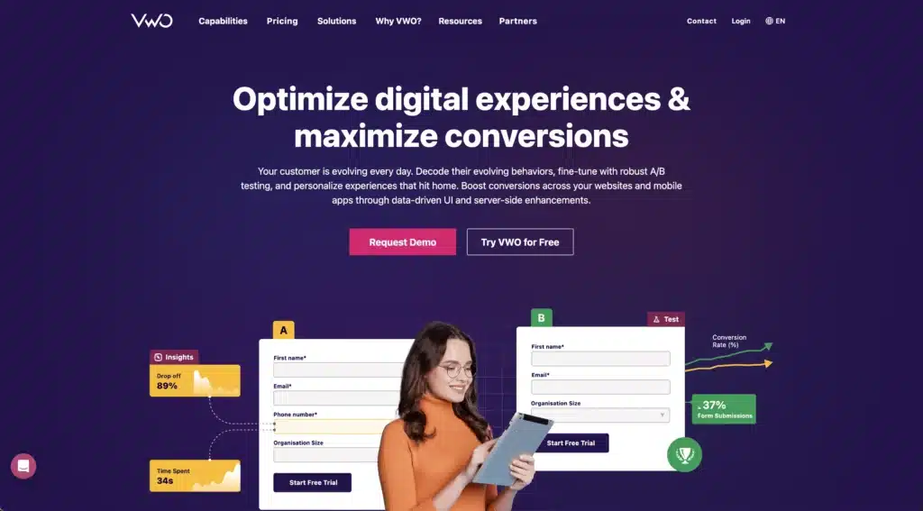
VWO has a real simple interface AND has a great system for setting up A/B testing and letting you know which version is the winner.
I’ve heard it said that every website should always have an A/B test running. The idea is that you should always be tweaking until you get to the point that you can’t increase the conversion rate of the site.
It’s at that point you want to do more of an overhaul to start seeing results.
Caution on A/B Testing
A word of caution about testing different versions of a website.
First, you have to be careful with the results you get. It takes quite a few visits in order for the test to return a result that has “statistical significance” especially if one version is only slightly better than another.
You might say, “Well, I’ll just run the test long enough to get a lot of results.” But, what happens when you run a test longer than a couple of weeks is you get “dirty data.”
You’ll have repeat visitors which won’t give you a clear idea of what someone would do if they saw a specific version of the site.
You can use an online AB Test Calculator to help you know whether or not you can trust your test.
Another thing to be careful of is muddying the testing with more than one type of variation. For example, don’t change the color of the button AND the text within the button. Pick one or the other.
If you change both you can’t be sure that the results are trustworthy.
You’ll probably have the urge to want to try a lot of different things out BUT just be patient and test things over time. That’s the only way to truly know what’s working and what isn’t.
Using SEO to Make Better Websites
I can almost guarantee you that every potential client you talk to will ask, “Do you guys do SEO, too?”
In case you don’t know, SEO stands for search engine optimization. What you’re trying to do is build a website in such a way that it gets found easily through search engines.
The problem with that is there’s no SEO button to press on a website. Instead, you’ve got to have an SEO strategy that builds a website’s online reputation and visibility over time. And, unfortunately, that’s not easily done.
It takes a lot of effort over a long time to start seeing results. AND THEN, Google might come along and change their algorithm. 😂
It doesn’t mean it’s not worth it. It just means that it’s important to set really clear expectations with yourself and/or a client you might be working with.
Again, do you need to be an SEO pro to be a freaking awesome web designer? No. But, you should have a decent understanding of how it all works so you can help clients make the best decision about their website.
There are really three components of SEO that you need to focus on in order to make better websites.
- Technical SEO
- Content
- Link Building
Let’s talk about each.
Psst…if you want to go even deeper you can check out this article I wrote that’s more of a complete guide on SEO.
Technical SEO
Technical SEO is what most people think of when they ask, “Do you guys do SEO?” It’s the behind the scenes stuff that can get really nerdy the more you dive in.
There is a TON OF STUFF that make up technical SEO. But a few things that I prioritize are.
- Broken links
- Header tags
- Alt descriptions
- Page Speed
Broken Links
Over time, a website starts accumulating a bunch of links on each page. In fact, a good SEO standard is to have at least a few links on every page that send users to internal AND external pages.
But, the thing about websites is that links change. Often they change a lot. So, a link that worked yesterday might not today because the page moved or was taken down altogether.
As a result, you’ve got to keep checking links in order to make sure you’re not sending people to pages that don’t exist any more.
OR you could use one of any tool that exists that help you do that without having to go one by one on every single page in a website.
I don’t know about you but option B sounds way better to me.
Tools to Find Broken Links
My two favorite tools for this are:
- SEM Rush (Paid Version)
- Screaming Frog SEO Spider (Freemium Version)
SEM Rush is kind of a must have if you’re wanting to get serious about SEO. They have so many tools that will help you to figure out a good strategy for ranking on search engines.
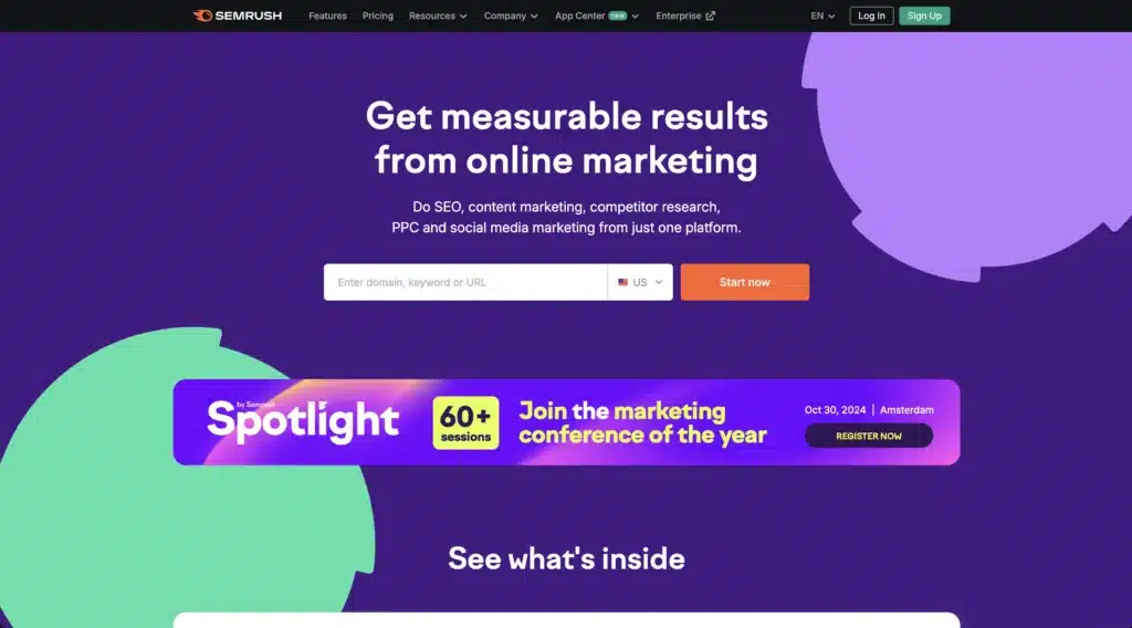
It’s not a cheap service BUT for what you get, it’s well worth it to help you make better websites.
One of the things I love and use often is their “Site Audit” feature. The Site Audit will look at every aspect of technical SEO on a website and give you tips on what to fix.
One of the best things about it is you get all of your broken links listed out for you in one spot.
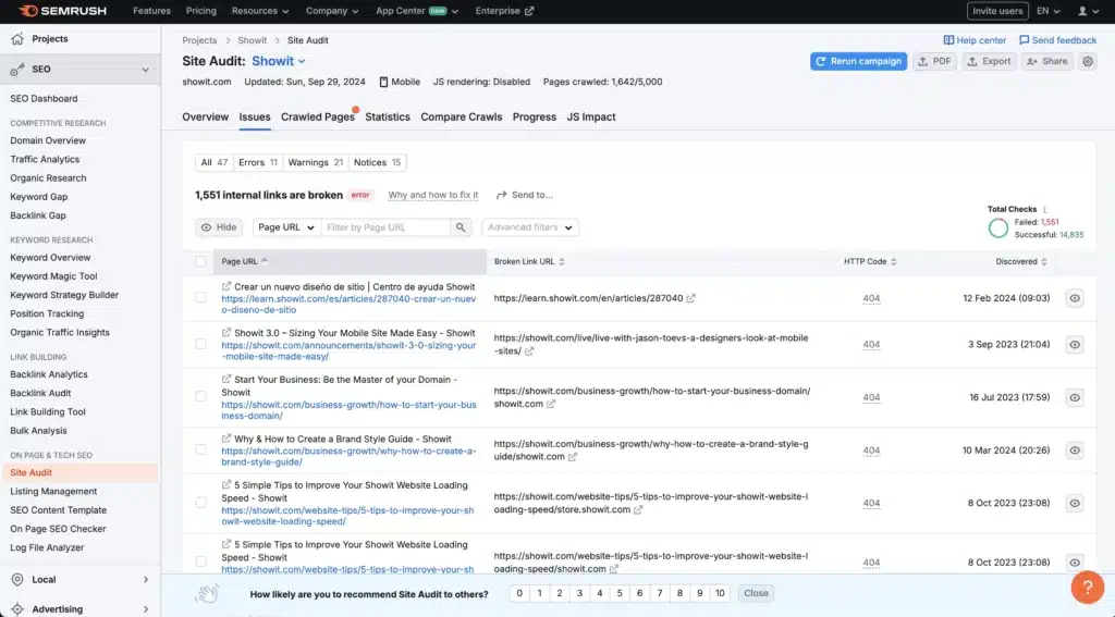
You can go one by one and remove those links altogether OR better yet set up redirects to go to an alternative. A redirect is better because their might be folks that have linked to that page externally.
The freeish option is a tool known as Screaming Frog SEO Spider. Silly name. Serious SEO help. Sorry had to.
If your site has fewer than 500 pages then Screaming Frog will scan all of your pages and give you a whole bunch of data on your site. For broken links you just go to the response tabs and filter it to show you 4xx responses which is computer speak for busted link.
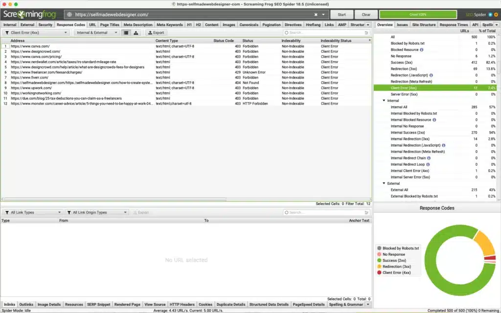
You can then click on a link and it will tell you where it lives. Then like an SEO super hero you can go to that page and make things right with the world.
Header Tags
Remember the font choices we made back in the branding portion of this super long article?
Well, those choices are not just about branding, my friend. They’re also a part of good technical SEO practices.
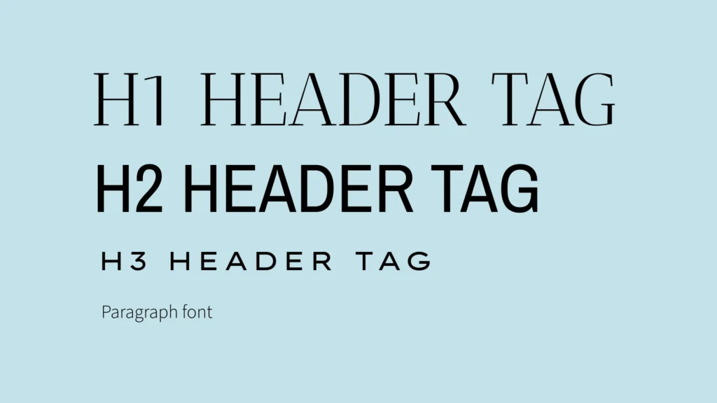
There are really 3 main html text tags we want to focus on.
- H1 header tag
- H2 header tag
- H3 header tag
- P or paragraph tag
Each of those tags play an important role in your technical SEO.
H1 Header Tags
Your H1 tag should be reserved for a piece of text that summarizes the entire gist of the page that it’s on. So, if you’re building a website for horse trainers in Austin, Texas you want it to be <h1>Horse Trainers in Austin, Texas</h1>.
The H1 tags let search engines know how to categorize the page when it comes to the keywords it’s showing up for.
So, you want your H1 tag to be descriptive of the content AND you only want to have 1, count em, 1 H1 tag on the entire page. If you have more than one it can ping that page negatively.
I’ve seen a lot of web designers use their H1 tag more as a decorative option for font. So, they’ll stylize their H1 elements a certain way and then use it to make certain text look similar.
That’s obviously not great for SEO. First, it means you’ll have a bunch of different H1 tags so it’ll be tough to know what kind of keyword you’re hoping to rank for BUT also the text won’t likely really say what the page is all about.
I’ve seen H1 tags say things like “Hi, I’m Rachel.” That’s great if you’re wanting to show up every time someone searches for “Hi, I’m Rachel” in a search engine.
But, not super practical otherwise.
So, limit your h1 tags to just once per page and make sure it’s a good summary of everything the user is going to get on that page.
H2 Header Tags
H2 header tags break up a page into sub sections. You can and should have multiple h2 tags per page AND you should use those to summarize a specific section of that page.
H3 Header Tags
H3 tags split up longer H2 sections. I typically only use those whenever the text starts getting longer in a sub section.
P tags
Your P tags should make up the majority of the copy on your page. You can say whatever you want in these and have as many as you’d like as well.
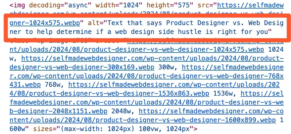
Alt Descriptions
Alt Descriptions are the descriptive text that you add to images. It can be done in HTML but any website builder worth it’s salt will have the ability to do it straight in the builder.
You want your alt descriptions to be less about stuffing keywords in your HTML and more about describing the actual image.
The purpose of alt descriptions is to give screen readers something to describe whenever someone who visual disabilities is using the website.
So, your description won’t be super helpful if it says more about the keywords you’re trying to rank for and less about what the image actually is.
Page Speed
The last thing we’ll look at in terms of technical SEO is page speed. And, this can be a tough one.
Google created a standard for websites called Core Web Vitals. Basically, they came up with some best practices for people to follow in order to give users a good experience when they visit a web page.
It gives you a score based on 5 things
- Largest Contentful Paint
- First Contentful Paint
- Cumulative Layout Shift
- Time to First Byte
Don’t you love how Google keeps things super simple in their naming conventions? That all makes perfect sense to the average human, right? (I hope you’re sensing the sarcasm)
In general, all of those things have to do with how quickly your website can do things.
Largest Contentful Paint or LCP deals with how quickly the largest element on the website loads. First Contentful Paint deals without how quickly a website goes from nothing to at least something. That something can be super small but something nonetheless.
Cumulative Layout Shift has to do with how much your content moves as it loads. It’s not a good experience to be reading a piece of text and then go missing all of a sudden because something else loaded and shifted everything down.
Finally, Time to First Byte has to do with how quickly your server responds once a request has been made.
What it All Boils Down To
Here’s what that all boils down to for you as someone trying to make better websites: Be thoughtful about what you’re putting on your web page and THINK about how every element could impact the person consuming the website.
Do you images really need to be high resolution? Do they really need to be super big?
The answer might be yes, BUT it’s better to ask the question than to just 5mb images without asking yourself if it’s the right decision.
I try to keep my images down to no larger than 300kb. And, I tend to like bigger images in my design. But, I’ve still never had a problem with quality issues.
I overcome size problems by compressing images in photoshop and then using third party tools like ImageOptim.
Am I perfect about it all the time? No. But, I do consistently try to think about the choices I’m making and how they’ll impact the experience someone might have when they visit the site I’m building.
Content
Next in our important things to consider about SEO line up is content.
If you’re picking one thing to focus on when it comes to improving SEO it should be content.
I’ve heard so many “SEO experts” talk about how important it is to make sure all your technical SEO is in pristine shape and make huge deals about the tiniest infractions.
But, all of that effort won’t make a difference if your content is no good.
IN FACT, I’ve seen website with subpar, dare I say, even poor technical SEO do really well in the search engines.
So, do yourself a favor, if you’re going to fuss about something, fuss about content.
So, then the question becomes, “What makes good content?” A lot of that is subjective BUT I tend to focus on 2 things.
- Good keywords
- Volume
Good Keywords
For keywords you want to focus on what are known as “long tail keywords.” Long tail keywords tend to have a lot of words in them.
So, if you’re a web designer instead of trying to rank for “web design services” try shooting for something like “web designer for small bakeries.”
All of the shorter keywords are going to be super competitive meaning lots of other companies with huge budgets for marketing have likely got that cornered. So, your goal is to find the crumbs they’ve left for you and make the most of them.
There might not be 100’s of 1,000’s of searches for long tail keyword phrases but most people don’t need 100’s of 1000’s of impressions to be successful.
So, how do you find what keywords to focus on? There are a ton of tools but a free one is Google Keyword Planner.
With a free account you can look up how well certain keyword phrases do in terms of traffic and in terms of the competition around those phrases.
You’re looking for the unicorns that have high traffic but low competition.
But, if you can’t find those, even phrases that have a decent amount of traffic work well.

Volume
Once you’ve found some good keywords to write content for then you’ve got to set about the business of making big, chunky articles where you’re explaining helpful tips about those key phrases.
Then do that over and over and over and over again.
Don’t skimp on the amount of words you’re using here. Try to at least hit 1,800 words or so. But, if you’ve got an article that’s 10,000 words long and still going that’s even better. 😉
The point is to be as helpful as possible. Pages that have a lot of super engaging content will keep people engaged for longer.
Google sees that and says, “This article might help even more people.” So, then you end up showing up in more searches.
Keep at it and you start to amount a hefty catalogue of helpful articles that people love to read.
Backlinking
The final thing I focus on when it comes to SEO efforts to make better websites is getting people to link back to my website or what is otherwise known as backlinking.
Google prioritizes web pages that have a lot of other references to it. It’s like academic articles. The articles that have the most references in other academic articles are typically the ones most highly regarded.
So, if you want your SEO to improve you’ve got to get other people to link to your website.
There are a few ways to do that.
First, you could just ask. People do it all the time. You find a website or web page that might be a good fit for a link to your site and you shoot them an email.
That might seem a bit intrusive. But, if your page or website is relevant to them it might actually be helpful.
I get people who reach out to me all the time. Most of the time I get request that have nothing to do with my website.
“Will you link to my human resources management article?” No. I won’t. That’s not what my website is about at all.
But, when I get decent requests that I can tell the person asking has really don’t their homework I consider it.
Improving Graphic Design Skills to Make Better Websites
Now, at last, we come to graphic design.
Graphic design is a huge part of what it takes to make better websites. Knowing how to lay things out and keep something visually interesting can lend itself to making websites that really stand out.
But, I gotta be honest. This was something that I knew hardly anything about and something I’m still in the process of learning today.
I had very little background in design before I started building websites. I just knew there were things that I could tell looked better than other things.
I couldn’t tell you exactly why. But, there was this intuitive sense that one thing was quality and the other thing was less quality.
So, over time I started looking into design principles and tried to understand objectively why something might be a better design than something else.
And, hear me out, there are some graphic design principles that will definitely help you make better websites.
But, at the end of the day, good design is good design whether or not it follows the right design principles or breaks them.
It reminds me of when i was learning how to mix music. I asked a friend if I was micing an instrument the right way. He looked at me and sound, “If it sounds good, it is good.”
The same is true for graphic design. If it looks good, it is good.
So, knowing all that, here are a few principles that I think will be helpful as you’re trying to design a stand out website. OR maybe help you better explain to a client why you made the decision you did.
The main elements of graphic design that I focus on are:
- Contrast
- Balance
- Hierarchy
- Pattern
- White Space
Let’s talk about each.
Contrast
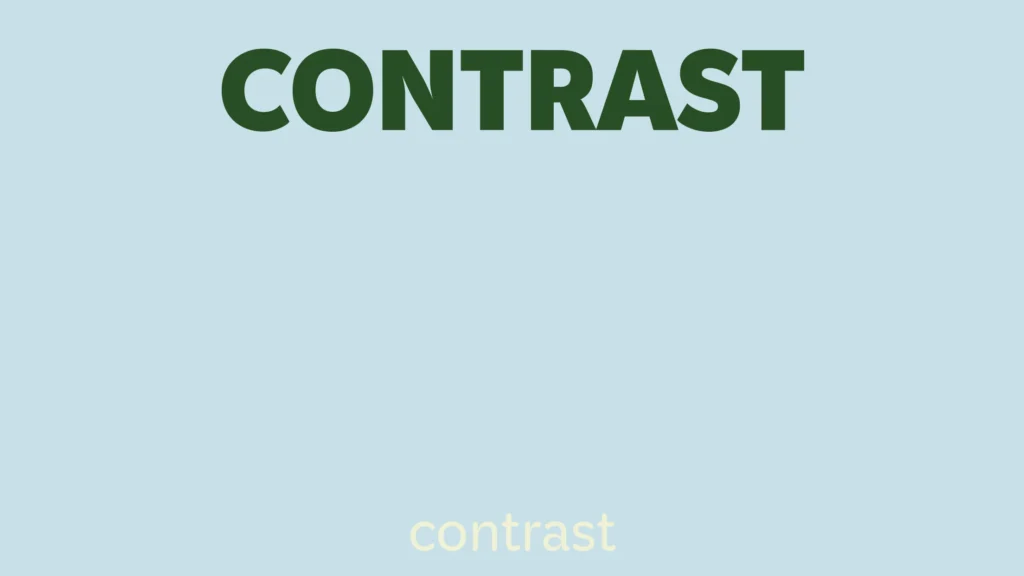
Contrast has to do with how different elements relate to one another. Is one element big while another element is small. Is one darker while the other is lighter.
There’s almost always a ying to a yang in graphic design contrast. By doing that you’re telling viewers where their eyes should be drawn to.
You’ll likely be drawn to a block of text that’s bigger than an image.
You’ll likely be drawn a single solo element that’s different rather than a group of similar elements.
That’s just how our brains work.
So, use this as a tool to help to get people to look at the important stuff.
BUT, in light of that, if you have NO contrast on your page the user has no idea of what to look at. So, they end up looking at nothing.
AKA they just don’t engage.
You’re job with graphic design and building websites is to make sure people are engaging with the web page they’re on.
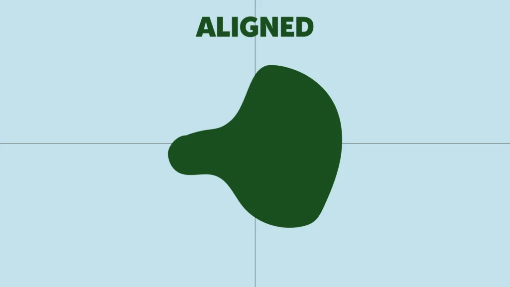
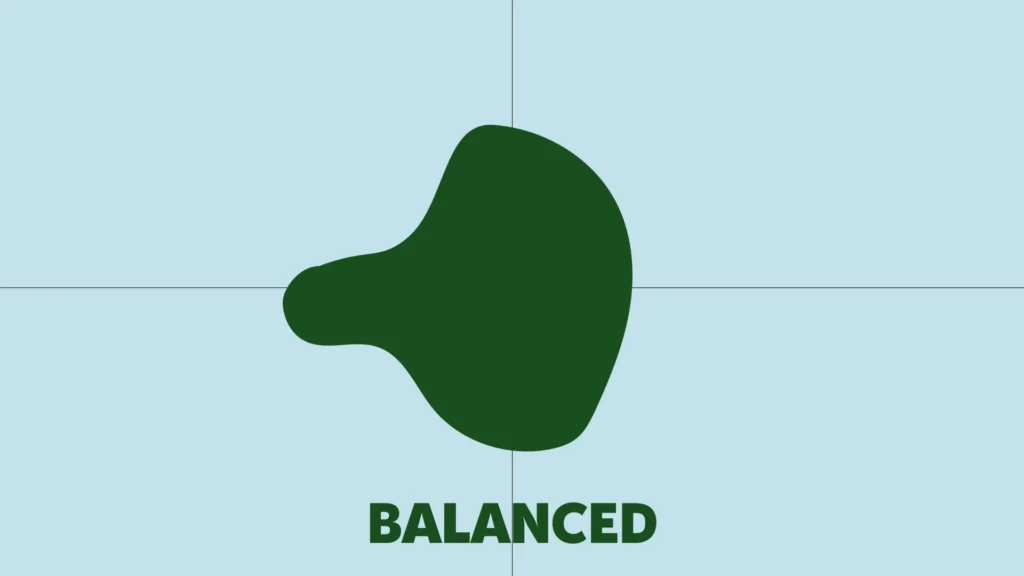
Balance
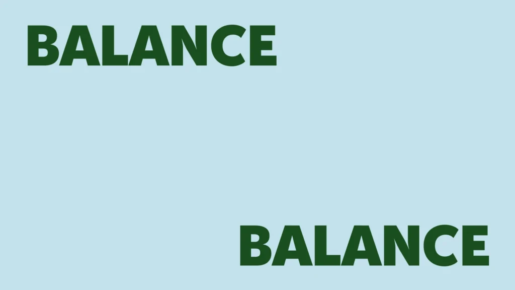
Balance has to do with the weight of different objects and how they are juxtaposed to one another.
Some things are perfectly symmetrical while other things are off balance. BUT, both relate to the principles of balance.
A lot of times in web design you’ll be able to perfectly align certain things according to their dimensions. BUT, be careful.
Just because they’re perfectly aligned doesn’t mean they’re perfectly balanced.
Some elements might have more weight on one side and even though they’re balanced symmetrically they’re not actually balanced.
In other words, you kind of have to eyeball it.
Hierarchy
Hierarchy has to do with how you adjust things visually to communicate importance to someone who is looking at the web page.
A lot of this has to do with the previous principle I mentioned: contrast. BUT, it also has to do with how you position the elements on the page.
Things that are placed in the center tend to draw your eyes.
There are even studies that have said people tend to read websites in Z patterns when they first look at it.
So, they’ll look at the top left corner of the screen then move to the top right. Angle down to the bottom left of the screen then move over to the bottom right.

That’s why almost every top section of a website has the main headline in the top left or top right of the viewport and the main call to action is in the bottom left or the bottom right of the viewport.
The web designers are trying to catch the attention of the user in their normal patterns of looking at a website.
The whole point of this is that humans have been conditioned to pay more attention to certain things based on position, weight and contrast. When you use those things to your advantage you can communicate what’s important in a section of a website without saying a word.
Pattern
Pattern has to do with the things that you choose to repeat and the things that you don’t repeat.
Our brains as humans are a hugely complex organ. But, you knew that already. That’s nothing new.
What is fun to realize is that we’ve learned over time what information we should pay attention to and what information doesn’t deserve our attention.
All of this goes back to survival.
It’s important to know what things are important to look at when we’re walking through a field trying not to get eaten.
Those blades of grass that all look the same and keep swaying in the wind…not so important.
That lion with it’s mouth open who looks like it’s ready to pounce…super important.
We tend to ignore stuff that gets repeated over and over because it likely doesn’t pose a threat.
Our brains are trying to save as much energy as possible, and, so, they’ll ruthlessly ignore stuff that they deem unimportant.
The good news is we can use that to our advantage in our efforts to make better websites.
The first thing you want to do make sure you’re breaking up patterns when you’re going from one section to the other.
In it’s simplest form, that means if one section has an image on the left and text on the right, make sure the next section has text on the left and image on the right.
All you’re trying to do is keep people interested as they’re scrolling down the page. The best way to do that is pattern interrupt.
White Space
Ah, good ole white space. The thing that makes everyone look at a design and inwardly take a deep breath.
I find a lot of my clients always emphasize their love of minimal and clean websites. You know the kind with plenty of white space?
And, I get it. It’s important. But, it’s not everything.
In fact, there’s been a little renaissance of maximalism these days that’s been pretty fun to watch and even borrow from.
But, for the time being, white space is king.
So, if you’re going to make better websites you’ve got to get good at knowing how use white space to your advantage without making things feel too sparse.
Thankfully, there’s a pretty commonly used layout in web design known as “the grid.”
Using The Grid to Make Better Websites
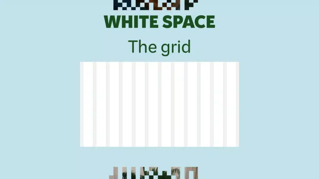
The grid in web design has 12 columns and 13 gutters. This has been a helpful tool for designers to layout different sections of a website.
They’ve also been used in popular css libraries like Bootstrap.
White space has to do with how each element or groups of elements relate to one another as it relates to distance.
You can use a grid to layout and make sure you’ve got enough space for things to feel like they’ve got room to breath.
But, honestly, for me, it’s always been about feeling it out. If things look too crowded then I give them some room.
If they feel too far apart then I separate them more.
I know that’s not super helpful. But, my encouragement to you would be to look at how other people are using white space and try to mimic what they’re doing.
Eventually, you’ll get an intuitive feel for how things should be space out.
Okay, you’ve now got a lot of solid principles to go out and start to make better websites. But, there are some really practical things that can be helpful as well.
We’ll turn to those things now.
Stick with One Website Builder
There are a lot of options out there for building a website these days. When I was getting started there were only a handful. And, most of those were pretty bad.
But, one things for sure. If you’re going to make better websites you can’t bounce around from one builder to another. Heck, you can’t even bounce around from one template to another.
You kind of have to pick something and stick with it.
This might be a tough one if you’ve got commitment issues. AND, it also might be tough if you’re in the early stages of making websites.
You might have picked a builder based on the recommendation of a friend only to realize it’s a lot harder than they let on. AND, you don’t really have a any kind of reference as to how hard it’s actually supposed to be.
So, maybe this is as good as it gets, right?
It’s important to try things out before you make a commitment to stick with just one.
I’m a huge fan of Showit. It gives you a lot of creative freedom and is one of the easier website builders to use. I may be a little biased because I work there. I also just love the platform.
If that’s not your cup of tea there are a lot of other great options out there.
Even Canva let’s people build websites these days.
So, try a few out and see if one clicks more than another. Then commit to using JUST ONE for all your projects when you’ve got a good feel for what they all have to offer.
Why Just One Website Builder?
It’s important to get super familiar with everything your builder can do AND HOW it does it all.
A big part of what it takes to make better websites is being able to pump out a lot of sites. You won’t be able to do that if you’re constantly learning and relearning the tools you trying to use.
In my early days, my process was to find a pretty WordPress template I liked and then use it no matter how it was set up or what type of builder it was created on.
I quickly learned that would cost me about 10 hours of time just roaming around the builder trying to figure out how to do simple things like change the navigation bar.
Don’t make the same mistake I did.
Think of it like a carpenter. A carpenters tools are sacred. You’re not going to find someone who one day says they’re using power tools and the next day says they’re using hand saws only.
Then every other day they switch it up for fun.
Can you get to the point where you’ve mastered a tool well enough that you’re able to branch out and try other builders? Yes.
But, wait until you really feel like you know one platform inside and out.
What if a Client Asks for Another Builder?
It’s here that you might be asking, “Yeah, but what if I get a client that wants to use another builder that I’m not familiar with?”
At that point we’re talking about how to “make a better business” not how to “make better websites.” So, really, that’s up to you.
But, I can say this. You won’t have any trouble finding people that are happy with and even prefer to use the website builder that you’ve committed to.
In some ways, it’s a small opportunity to niche down.
Think about it. You become the go to guy or gal in that space for X website builder. That could garner a lot of attention and a lot of clients.
Will you have to turn away people that only want to use a platform you’re not using? Potentially.
But, in the time it would take you to learn a new platform and finish a project for a client you could have done 2 or 3 projects with the website builder of your choice.
So, in the long run, it’s a better decision to stick with one builder.
Find Websites and Other Web Designers That Inspire You
In another life, I was a worship pastor. That’s a funny way of saying I did the music for my church as a full-time job.
One of the things I loved most about my job was working with younger folks to become better musicians and worship leaders.
You could often times find me in my office with a young guitar player who was just getting started. I’d be doing my best to show them how to learn a new song or work on a new technique.
One thing I realized was that if these young people on my team were ever going to reach a level that would be considered “professional,” they’d have to see what that looked like in a live setting.
It wasn’t enough to just listen to albums and try to emulate them. You had to see musicians playing the stuff.
So, I put a high priority on getting our young folks around other really great musicians who were a few steps ahead of them.
And, that single thing helped them grow more than any online tutorial ever did.
How to Grow in Skill as a Web Designer
What was true for those young musicians is true for us as web designers.
We have to become students of work that inspires us AND we have to try to get around people that are a few steps ahead of us in the web design world.
The first of those tasks is a little easier than the second. It’s become easier and easier to find really good design out there on the internet.
Find Websites That Inspire You
One of my “go-to” tools for that is a chrome extension called Muzli. Every time you open a new tab (which for me could be in the 100’s per day) you see a curated list of design inspiration.
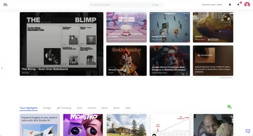
Not everything you see will be a website. BUT, it won’t be hard to find amazing sites that are worth a look.
And, it’s always good to find inspiration in other mediums, too.
I try to spend a few minutes a day just scrolling through Muzli trying to find ideas that will be the inspiration for the next website I build.
Find a Way to Store and Organize Your Inspiration
You might think that once you found inspiration your job was done but NOT SO FAST!
You need a way to to take the ideas you’re finding and store them for future reference. If not all those great ideas will float in and float away.
Plus, whenever it’s time to make a new website you’ll have a hard time finding everything that once inspired you.
I personally use Apple Notes to store all of my web design inspiration. BUT, my encouragement to you is to use whatever works best for how you work and think.
A complicated Notion doc might not actually help you. OR it might be exactly what you need. It’ll take some time to figure out a rhythm BUT whatever you do DON’T TREAT YOUR WEB DESIGN INSPIRATION STORAGE LIKE A JUNK DRAWER.
We’ve all got them in our houses. Growing up my family filled an entire junk drawer to the brim and then just made another one. So we had two.
But, your web design inspiration won’t be super helpful to you if you organize it that way.
That’s kind of what I did when I first started organizing all the cool sites I was finding online. I just saved them under one generic bookmark on my chrome web browser.
But, then when I went to find something I’d have to open like 100 tabs and sift through them all. Nah. That doesn’t work.
Take a few seconds on everything you find. Snap a screenshot. Create a file. Copy and past a link and add the screenshot. For extra credit give it a brief description and categorize it.
You’ll thank me later.
How to Find Other Web Designers that Inspire You
Okay, I told you the first part was the easy part, right? This second part is not quite as easy BUT it will be worth it’s weight in Gold if you can make it happen.
You’ve got to find people that inspire you in web design and figure out a way to get around them if you want to make better websites.
As I typed that I could hear all of your objections in my head:
- I don’t know any web designers
- I live in a small town a 3 hour drive from a big city
- Meeting people scares me
I get it. I feel all of those things, too. But, you’ve still got to find a way to make it happen. The good news is that in the age of onlineness it’s easier than ever.
There are basically two kinds of ways to do this.
- Find a real person and get around them either by way of in person or online interaction
- Find someone on line and online stalk them
The first way is a much better method but it may be a little harder. Actually having interaction with someone can catapult your growth in ways that just following someone online can’t.
Find People You Can Be Around
I remember when I was first hired at Showit. The projects I was working on took less than half the time they normally would when I was a solo freelancer because when I had a problem I could just ask the guy next to me how to fix it.
No more googling until 3 in the morning just to have to throw up my hands in defeat when I didn’t find the answer.
Listen, I know this site is called “Self-Made Web Designer” but if you want to be “self-made” you’ve got to get some other “selfs” in your corner. Aka, you need people around you that can help.
So, find some meet ups to go to. If there aren’t any near you, find an online community that works. But, don’t quit until you find likeminded people that can challenge you as you grow.
Stalk Someone Online
Another option is to stalk someone online that inspires you. This isn’t quite as good as actually finding a community BUT it’s still helpful.
And, honestly, if you can, you should probably do both.
There are plenty of folks out there that are doing amazing work that you can follow from a distance. A few folks I love are
- Hoodzpah
- My friend and fellow web design coach Josh Hall
- Mike Janda
- Tonic Site Shop
The list goes on and on.
Inevitably, you’ll have folks that you resonate with more than others. So, find folks that fit your vibe. Give them a follow and consume absolutely everything they’ve done and/or will do.
Don’t Neglect Mobile Designs
The world of websites lives on multiple plains. Okay, reading that back I realize that’s a super esoterical way of saying you’re going to have to design for multiple screens sizes.
Often, I find myself neglecting the mobile screen sizes in favor of the wide open space of desktop screen sizes.
It’s easy to do. There’s more space to design more stuff. More freedom to put stuff in different places.
BUT, you’re going to have to get really comfortable with design for smaller screen sizes if you want to make better websites.
Most websites will have a substantial amount of track on mobile devices. Some might even have MORE traffic on mobile than on desktop.
So, if you choose to think of the mobile design as an after thought you’re going to neglect a whole bunch of people that don’t care about the desktop version of your site.
Here are a few things to consider when you’re working on the mobile side of you or your client’s website
Consider a Mobile First Approach
Mobile first design prioritizes the website experience on smaller screen sizes. AKA it starts with the mobile and ends with the desktop RATHER than the other way around.
This will help you make better decisions about what it is you’re doing for your website on smaller devices that probably have less download and upload strength.
Often times web designers will design for the big screen and then try to fit in all the stuff from the desktop size into the smaller sizes.
The main thing to do here is consider how you consume websites on your mobile device.
Where did you come from when you landed on the page? Was it from a social media app? Did someone text you a URL?
Then once you got there what were you hoping to do? Find the right information quickly and then get the heck out of there? Save things for later when you could dive in a little deeper?
All of the answers to those questions are important and can really change what decisions you make on the design of your website.
Ditch the Hover Effects
Designers love their hover effects. And, don’t get me wrong they can be cool. But, they’re absolutely useless on mobile devices.
Why? Because no one’s hovering. You’re scrolling and your clicking (errr…pushing things with your fingers).
When you add really complicated hover effects it can make things more complicated on smaller sizes. People have to click a button once to get the hover effect and twice to get the button to go where it’s supposed to go.
It’s not that you can’t use hover effects. It’s just that you need to turn them off on mobile.
Be Careful With Smaller Sizes
One of the biggest mistakes I see designers make on mobile sizes is the turn down the size of things WAY too far.
Text becomes unreadable and buttons become unclickable all because the designer forgot to consider how someone on an iPhone would interact with the content.
Don’t let that be you!
Keep your font size at 16px minimum and in general keep buttons to a minimum of 44px x 44px.
Doing that makes it easier for users to interact with your pages on mobile devices.
Slow Down on the Scroll Animations
Scroll animations are fun. They’re all the rage these days. But, you’ve got to be super tasteful with them on mobile or they become distracting quickly.
The animations and interactions that happen on a web page is called “scrollytelling” in the web world.
Storytelling meets scrolling? Get it?
It’s definitely a way to keep users interested in your web page which hopefully keeps them on longer which hopefully leads to more sales, sign-ups, discovery calls or whatever.
But, you’ve got to remember you have very limited space on a mobile device. So, if you got things flying in and out and all over the place it’s going to be really tough for users not to feel overwhelmed.
I’m not saying don’t do it. BUT, for sure dial it back on mobile.
Get the Reps In
Now that you’ve decided on one website builder, you’ve stored up some inspiration and found a good community it’s time to put in the work.
This is the part of what it takes to make better websites that isn’t sexy. It’s just grueling work that you’ve got to repeat over and over again.
The only way you’re going to make it through this stage of what it takes to make better websites is to put your head down and learn to love the process.
You’ve got to learn to love “the doing.”
This is where so many web designers get it wrong. Hear me out.
The result will be that you make better websites. But the only way to do that is to forgot about it for a while and just focus on the process.
Learn to appreciate every aspect of what it takes to build a website.
Wrapping Up On What it Takes to Make Better Websites
Wow, if you’ve made it this far, honestly, big kudos to you.
This is such a large article. But, it’s legitimately everything that I can think of when it comes to making better websites.
But, if I could give you one final piece of advice it would be this: don’t let discouragement keep you from still trying to be a better web designer or build a better website.
It’s so easy to look at other people’s work and think, “Sheesh, they’re so good. I’ll never be that good.” But, here’s a secret: I don’t know a designer that doesn’t think that. Even the best designers.
We all feel like we suck when we put our work up to someone else’s.
You can’t let that hold you back from waking up every day and trying again.
So, wherever you’re at in your journey don’t be discouraged. No one starts out making amazing websites.
It takes a lot of work over a lot of years. But, one day you’ll look up and you’ll see huge steps of growth and you’ll be glad you didn’t give up.
Leave a Reply
This free, 4 video course will give you all the tools you need to start freelancing as a web designer & earning extra money.
• How to get started from scratch
• How to find your first clients
• How to charge higher rates
Become a web designer and land high-paying clients


Your website is the best resource I have found anywhere on the internet. You list resources that no one else does. THANK YOU SO MUCH.
Thank you so much Sarah! Looks like you’re a Showit user!?