I’m gonna be honest with you. It’s taken me a while to cultivate the skills necessary to deliver what I would consider “creative web design.”
If early images of my portfolio are any indication that no one is a lost cause for building creative websites then allow me to painfully show you what my first few projects looked like.
Ughh….

Ughhhhhhhh…
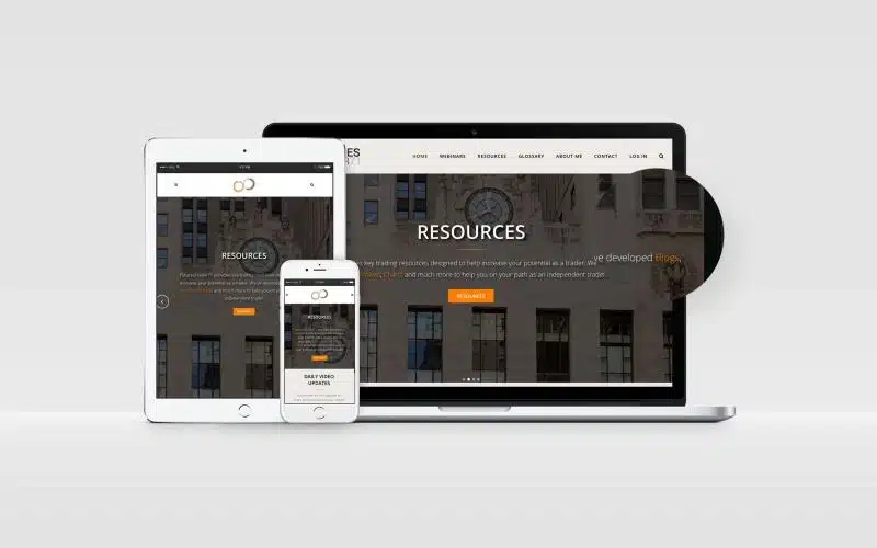
Ughhhhhhh…
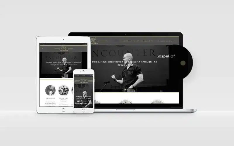
Now, give me a second while I cry a little bit and regain my composure.
I’m being a bit dramatic of course, BUT creative web design isn’t a skill that any of us are born with. Instead, it’s something that has to be cultivated.
It takes hours that turn into years of sitting down and creating bad work until one day things start to shift. All of the sudden people start looking at your work and asking things like “that’s cool…how’d you do that?”
I wish I could say that my lack of creative web design abilities was a very short phase like the “I only wear Nike,” stint I had in 8th grade.
Nope…it’s only been until fairly recently that I would say I’m starting to feel comfortable with how my work looks.
Web Design Horror Story
Not too long ago I was hanging out with a few other web designers and a site I built became the topic of conversation. Now, before I dive too deeply into this painful memory let me say that I did ask for their feedback.
I was hoping to get a few insights on things I could have done better. And, they definitely did that. But, they also made fun of it…hard.
In fact, some of the design elements of the website have become a running joke. Let’s just say I’m still getting over all that 😂
Listen. That stung. But it also fired me up a little bit. I realized that if I was going to build my own creative web design abilities I was going to have to put some real effort into getting better.
So, I decided from that point on that I was going to work and hone my skills to build creative websites that really stand out.
Here’s what I did.
Inspiration for Creative Web Design
Before I was a web designer I was a musician.
One of the lessons I was taught when I began to write songs was that you HAVE TO become a student of other songwriters.
AKA listen to lots of music. Analyze it. If a song makes you feel a certain way try to figure out why.
Is it the chord progression? The way they phrased a certain lyric? The strings?
Study, study, study.
What’s true for creative music is true for creative web design.
If you want to become more creative as a web designer you’ve got to become a student of other people’s websites.
Find sites you like. Save them. Think about what’s good. How would you do it differently?
Study, study, study.
But, here’s the deal. You can’t just do it when you’re working on a project. You’ve got to be doing it ALL. THE. TIME.
Make a habit of it. Put it in your schedule. Whatever! Just keep it consistent.
Where to Find Creative Web Design Inspiration
So, where do you go to find the most creative websites out on the internet? After all, there’s a boat load of websites and, if we’re being honest, most of them are bad.
My favorite place to look is actually just a chrome extension called Muzli.
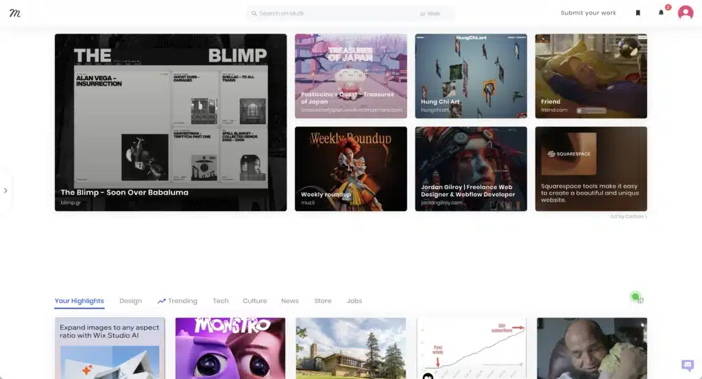
After you install Muzli, any time you open a new tab on your web browser you’ll see a curated list of really cool designs.
Some of the things you see have nothing to do with websites BUT a lot does.
I will typically spend about 10 minutes a day just looking at whats new on my Muzli feed. And, that took some getting used to.
At first it felt like I was just wasting time scrolling through cool designs. But, something started to happen.
I started seeing patterns. I started taking ideas from the websites I was looking at and running with them on my own projects.
A few other really great places to find creative web design ideas are Maxi Best Of that offers up a new batch of websites every single week.
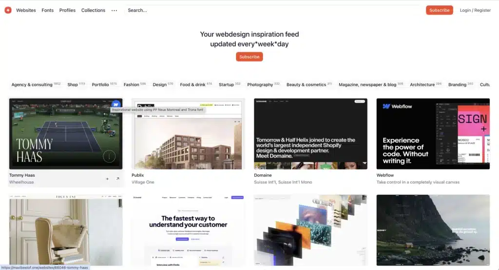
Or One Page Love that is all about finding cool one page websites.
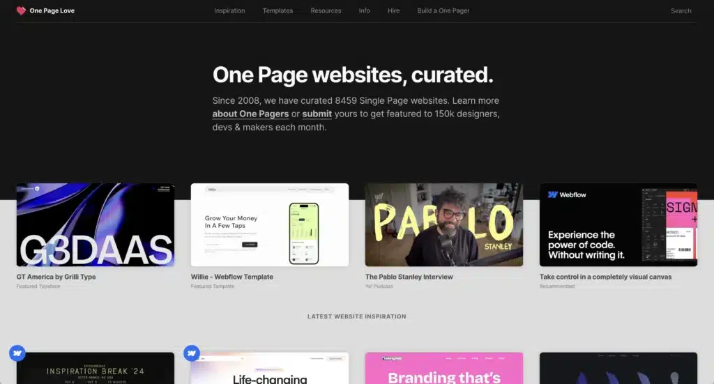
But, it doesn’t stop there! You could find creative web design ideas on Pinterest or Instagram even!
The point is you’ve got to keep your eyes open and be looking for websites that stand out. When you do that it will sharpen your own creative skills.
Develop a System for Storing Ideas
Okay, you know you need to be looking for creative web design inspiration every day. BUT, what do you do with all of those creative web ideas?
At first, I just bookmarked all the sites I thought were cool. But, that became a problem pretty quickly.
Pretty soon I had hundreds of ideas in one big folder and all I could see was the link that was saved.
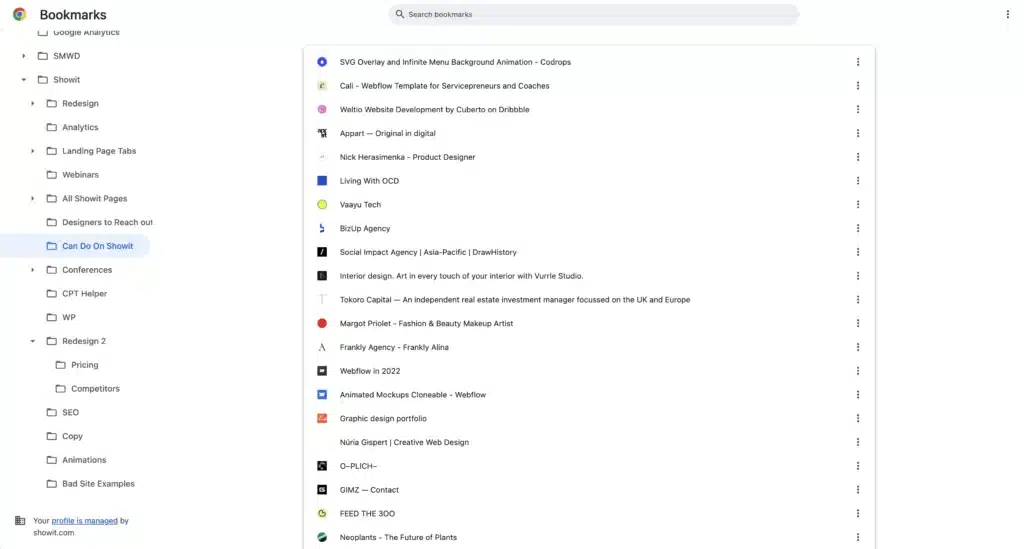
So, if I ever wanted to go back and find an idea I had to open all 97 saved webpages and then go through them one at a time.
AND, sometimes websites shut down OR change the way they look. Often times I’d be looking for something that wasn’t there.
That’s when I found Tiago Forte’s “Building a Second Brain.”
Tiago developed a system to jot down ideas in such a way that keeps them organized and easy to reference if you ever need to come back to it.
At first, I started doing it for the books I was reading (cough…cough, listening to). But, then I thought, “Hey! Why not take screen shots of websites and create folders for the different creative web design ideas I’m finding?!”
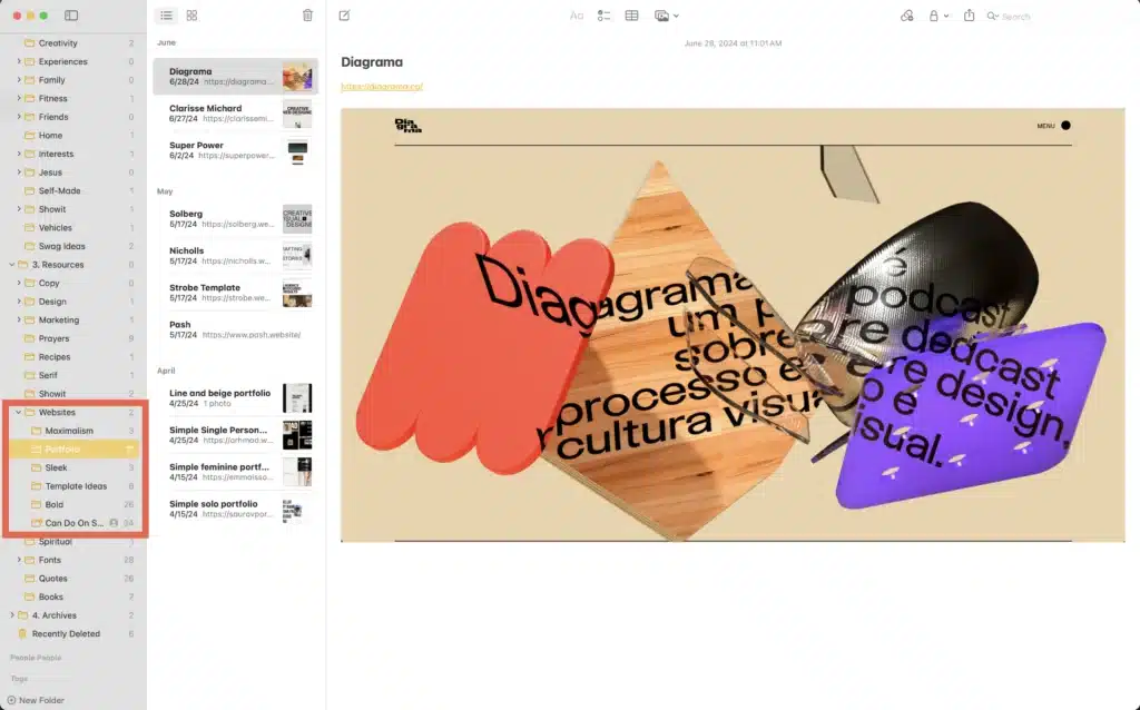
I made different sub folders for different types of websites or what I was thinking when I first saw the site.
I’m sure there are cooler ways to do things like with some kind of elaborate Notion template. But, for me, I’ve found that have to keep things simple AND incredibly easy if I’m going to make it any kind of habitual thing.
So, I stick with a apple Notes.
One fun tip! When you’re taking a screen shot on a Mac if you hold down control it actually copies the image to your clipboard. So, rather than taking a screenshot. It saving to your desktop. Then dragging that over…yuck 👎🏼
You just take the screen shot and paste it to your notes 👍🏼
Don’t Copy. Make a Remix
Okay, you’ve got some cool creative web design ideas. You’ve got a fun way to store and organize them. Now what do you do?
You take those ideas and you make them your own.
It would be really easy to see what others are doing and just copy them. And, trust me. There’s a lot of that going on all over the internet.
But, the key here is you’ve got to take what other folks have done and remix it a bit.
Let me show what I mean.
This is a template I’m working on for the Showit Template Store.
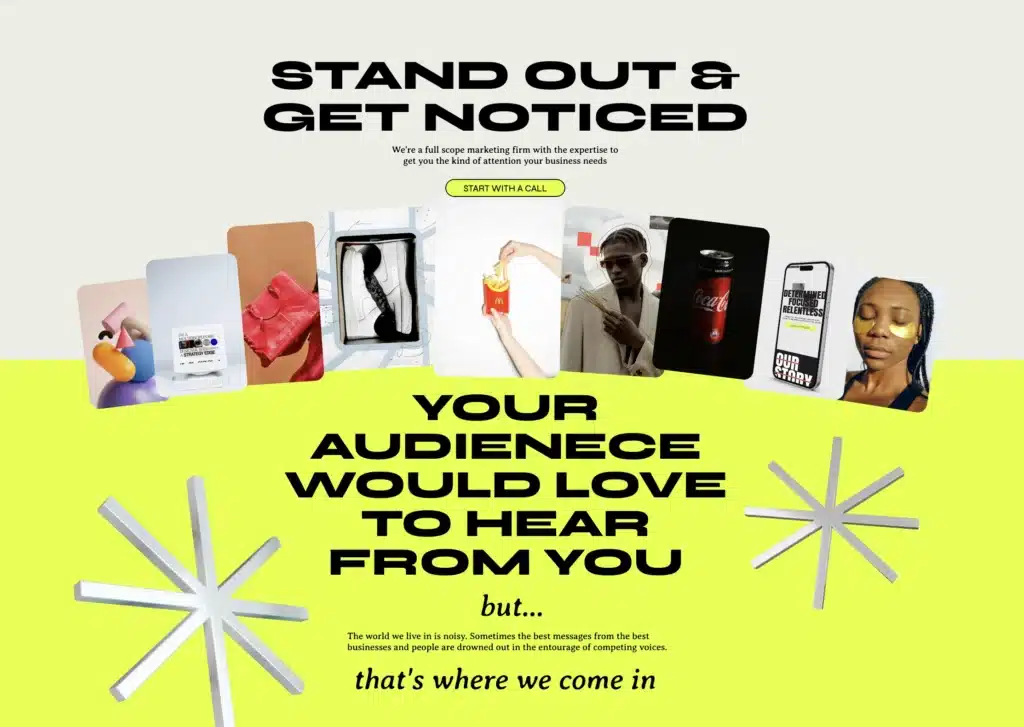
Wanna see the inspiration I used for it?
Here:
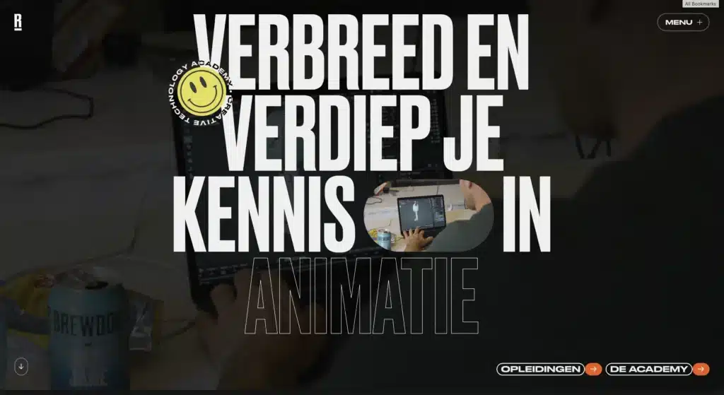
Here:
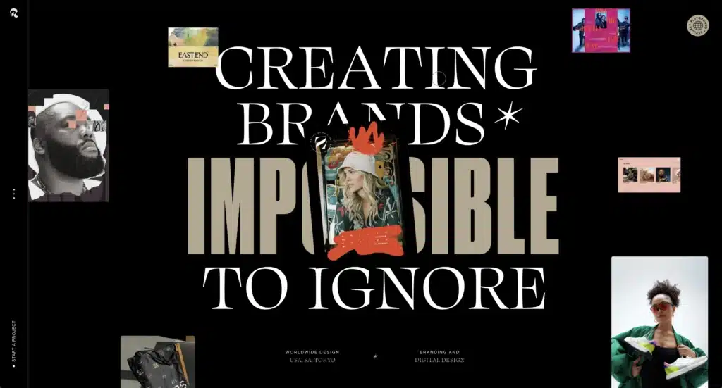
And here:
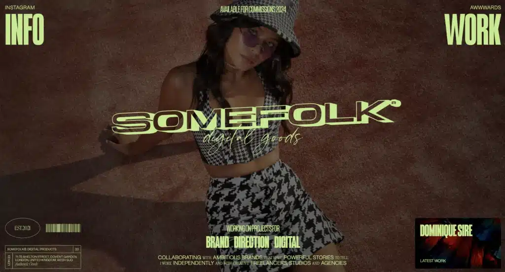
Do those look like they were the inspiration for the first website? Kind of.
But, as I got in and started working with the site I was building I had to make changes to fit my specific scenario.
For instance, I have to use Google Fonts because the website I was building will be a free template. Some that brings up a lot of limitations.
There are other limitations, too! Like the template can’t be too complicated to use because we’ve got folks who will be building a website for the first time.
People won’t want to use the template if I include anything on there that’s too advanced.
All of those limitations forced me to get creative about how I was implementing the inspiration that first got me started.
It’s a classic Austin Kleon’s “Steal Like an Artist” concept.
You take things that inspire you and you try to make them your own using the tools you know how to use and all the unique limitations those tools bring.
A Case for Copying Creative Web Design Ideas
Now, I will say that copying is probably not a bad idea when you’re at the beginning stages and are just learning.
Before you more senior web designers start to throw daggers at me let me explain. A lot of creative skills start with outright copying other artist.
Take learning an instrument.
No one starts to play the guitar by composing music. No! They learn to play other people’s songs first.
Simple stuff at first but over time they scale up the complexity of the songs they’re learning. Then, eventually, after they’ve learned to play dozens maybe 100’s of other people’s songs they start to write their own stuff.
And, I think that’s alright as you’re starting out with web design as well.
There’s a way to do it ethically, though.
First: don’t copy someone’s work and pass it off as your own. Especially, if it’s work you’re doing for a client.
Second: give people credit.
I was at a conference recently and one of the speakers was the youtuber Jon Youshaei. He talked about how Beyonce’s inspiration for her famous “Single Ladies” dance was from a dance called “Mexican Breakfast.”
The thing is Beyonce credits her inspiration. She doesn’t pretend to act like she’s just coming up with stuff straight out of her noggin.
You can see from the video that there are a lot of principles she borrowed BUT Beyonce had to make them her own in “Single Ladies.”
This is the perfect example of taking inspiration and remixing it in a ethical way.
Practice a Little Every Day
Just like everything else, if you want to grow your creative web design abilities you’ve got to practice a little bit every single day.
This is a tough one. If you’re like me, you tend to go through seasons where you’re designing a lot and seasons where you’re hardly doing any design.
It all tends to center around whatever project I’m working on.
Big projects with close deadlines. Lots of design.
Outside of that, not much design.
But, you’ve got to set aside time every day to do flex those creative web design muscles just like you’ve got to make time every day to find inspiration.
The key here is you’ve got to keep yourself from editing as you’re designing!
Creative Web Design Lessons from a Writer
I just recently read a book by Anne Lamott called “Bird By Bird.”
Anne is a writer who teaches others how to do the same. One of her main points is that a rough draft should feel like a rough draft.
Think about it. It’s called a rough draft because it’s supposed to be rough. You shouldn’t want to share it with other people. In fact, it might not ever see the light of day.
But, the simple act of just sitting down and doing something means everything.
The same is true for design. I know for myself that I tend to obsess over little details. I nudge them over pixel by pixel until it feels perfect.
But, editing while you create can be one of the biggest things that stifles creative web design.
Instead, let your rough draft designs be bad. Give yourself permission to explore ideas without criticizing what you’re creating as you’re creating.
Save that for the next day.
Don’t get me wrong. It’s not like you should NEVER edit what you’re creating. You definitely need to. It just shouldn’t be on the first pass.
So, go out there and make some bad web designs every day. Eventually, those designs will get better and better and you’ll start to be the person people look to for inspiration.
Find an Honest Feedback Loop
It’s one thing to practice a little every day. It’s a whole other thing to practice, get feedback on that practice and then go back and improve the first run.
In “The Talent Code,” Daniel Boyle talks about how people who would be considered “gifted” or “talented” weren’t in fact born with anything different than anyone else.
They just created rhythms of practicing and getting insightful feedback along the way. Great news for folks who feel like they got the short end of the genetic stick!
Will you get better if you practice without feedback? Probably. But, the difference a little bit of insight from someone else who’s maybe a little bit further ahead of you will make a staggering difference.
You remember the early days of American Idol? Beautiful days to behold my friend.
For the first time folks who would reserve all of their musical talent for the shower were now proudly displaying their abilities for the entire nation.
And, some of those folks had no business being on a stage with a microphone. They were bad. Really bad.
But, what made it funny was the fact that these people had no clue just how bad they were. They were singing loud and proud like they were the next Aretha Franklin.
After they were told they wouldn’t be going through to the next round was typically, “But, everyone tells me I’m a good singer!” 🤦🏼♂️
You need someone or a whole bunch of someones in your life to give you honest feedback about your work.
So, find some trusted friends. Join a community. Ask for feedback on what you’re doing. Then go and make changes.
Develop Your Own Creative Web Design Style
I was at a conference not long ago where Jesper Kouthoofd of Teenage Engineering went on a bit of a rant about how he hates that so many designers create stuff that just looks like everyone else.
He then encouraged every one to develop a style distinctive enough that if someone was to look at it they’d know exactly who designed it.
I love that idea.
Too often we try to blend in and create designs that are safe or consumable for the masses. Don’t get me wrong, designing things that people want to buy is important.
But, I also think there’s a way to design things that leaves your signature no matter who you’re designing for.
I get the arguments that there’s a difference between art and design. Art is made to be considered beautiful by the person creating it and design is made to be considered beautiful by the people consuming it.
I’m just not buying it.
Artist HAVE to consider the people consuming their artwork if they ever want to get paid. Sure some people decide to remain in obscurity and we recognize their genius years later often times after their deaths.
But, the majority of artists want to eat and are okay to create in order to be able to do that.
So, figure out what your unique style is and put that style into the websites you’re building.
How do you do figure out what your unique style is?
You play around with a lot of different ideas. Ask yourself what you like about other people’s work. Then try to figure out how to put your own spin on things.
It’s the same concept that we talked about with the remix vs copy conundrum.
But, don’t be afraid to use those ideas in the projects you’re working on. It might cause some people to decide not hire you. But, eventually, people will come to you BECAUSE of your style.
And, the good news is when that happens you get to create designs that you’re really proud of.
Creative Web Design Ideas
Alright, so, we’ve covered all the creative web design practices you need to grow as a web designer. We kind of had to start there.
It’s like they always say, “Give a man a creative web design idea and he’ll be creative for a day. Teach a man creative web design practices and he’ll be creative for a lifetime.”
They say that right? Either way, I also wanted to spark some creativity in you by showing you some really creative things I’ve seen on the internet.
Whatever You’re Doing, Turn the Volume Up
If there’s one thing I’ve seen consistently over the last few years in web design it’s this: everything has gotten louder.
Colors are brighter. Fonts are bigger. Motion is more motiony.
At first I thought things were trending towards a more maximalism style to contrast the minimalism that the last 10+ years of web design has enjoyed.
But, instead, I’ve just seen people get more drastic about whatever it is that they’re doing.
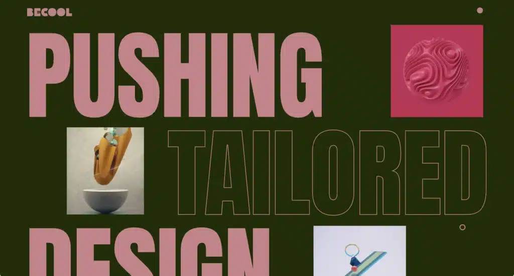
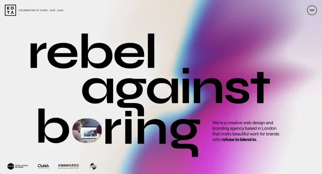
As the world of the internet becomes more and more crowded, going big is one way to really grab people’s attention.
So, don’t be afraid to push the boundaries a little bit with size.
AKA: it’s ok. Make the font bigger.
Drastic Contrast
Another thing I’ve seen in some really creative web design is the use of stark contrast.
The last season of design trends was one of hushed tones, muted colors…beige, beige, and more beige.
And, listen, I’m okay with beige. In fact, I love beige. Just put a pop of color on top of that sand looking background.
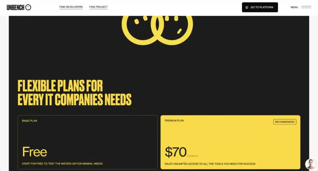
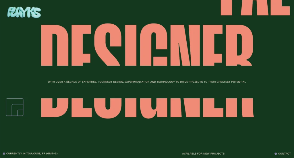
You can create high contrast in a few ways. By scale, by color or even design.
So, add a smaller font right next to a bigger font. If a few sections have been beige, hit ’em with a pop of color.
I’ve also seen a lot of folks use some drastically different typefaces. They’ll have a standard Sans Serif next to a pretty drastic Serif font and it totally works.

The basic idea is you don’t want your website to feel like a hospital. Don’t be afraid to mix things that shouldn’t go together.
After all, it wasn’t long ago that a huge rule of fashion was that black and blue didn’t go together. Look at us now!
Play with Layout
There isn’t much unexplored territory when it comes to layout design these days. After all, designers have been playing with layout since…well, since there have been books.
There’s basically 5 different ways to place copy and images on a site TOTAL.
You’ve got the classic text on the left image on the right option:
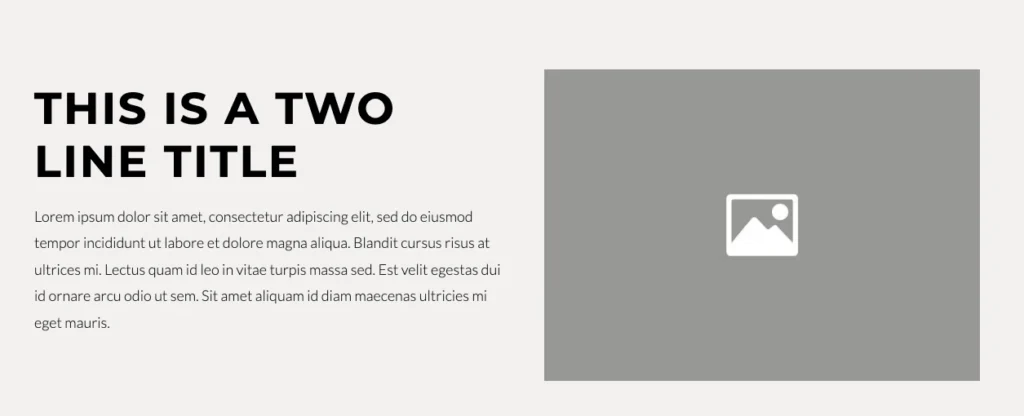
Or you could get really crazy and put the text on the right and image on the left!
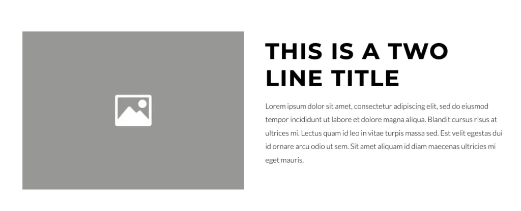
Or if you’re feeling spicy you could make the text and image straight up and down the middle.
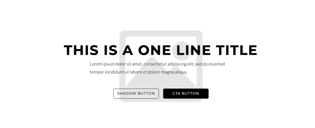
Throw ’em a curveball with text columns.
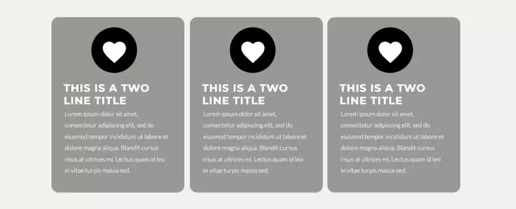
Or you could throw caution to the freaking wind and put both text AND images on the same sides!
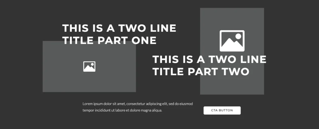
That’s it really. Everything else are just slight variations of those different layouts.
The thing is you can’t really think outside of the box here. Users have certain expectations when it comes to layout patterns. And, you’ll lose them altogether if you get super funky.
Now, maybe you want to do that. Maybe you’re trying some exploratory designs that really push the boundaries.
That’s great! It just won’t convert very well. This is where you start entering the world of creative web design for art’s sake rather than for business.
I tend to lean more toward the practical side of websites. A website should have a goal related to a user action that means something to the website owner.
- They sign up
- They purchase
- They like
- They share
- They comment
AKA: just engaging isn’t a great goal.
That doesn’t leave much room for creative web design in terms of where you place stuff on the page.
So, what do you do? You take your limitations and you run with them. I’m of the belief that it’s only within confinement that we can be truly creative.
So, take the rules and patterns that have been long establish from the world of print design and figure out how to bend the rules a bit.
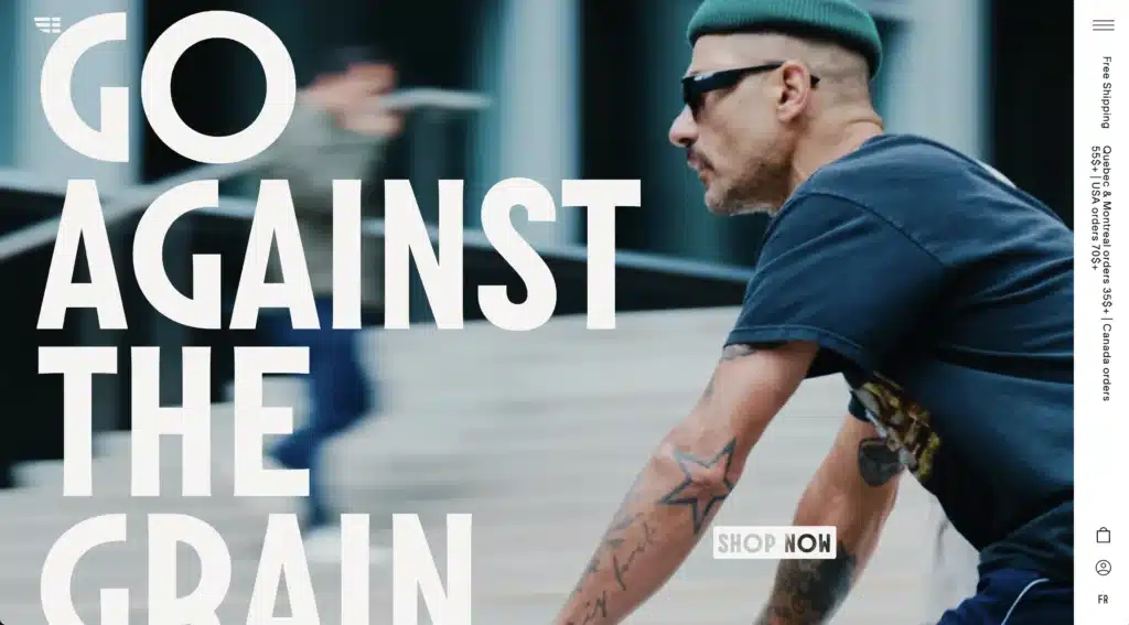
Add word breaks in weird ways.
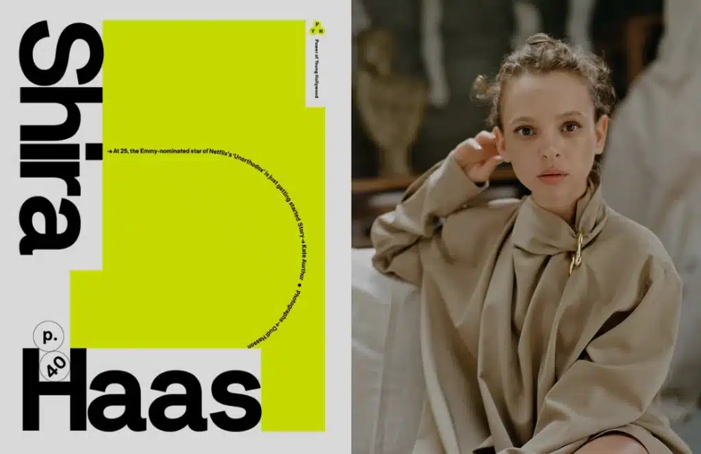
Add unusual spacing between words that should be close together.
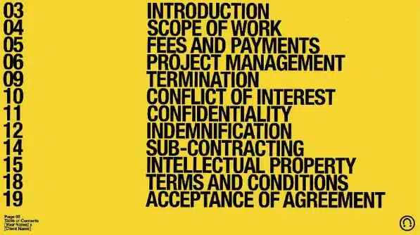
Rotate the text vertically.
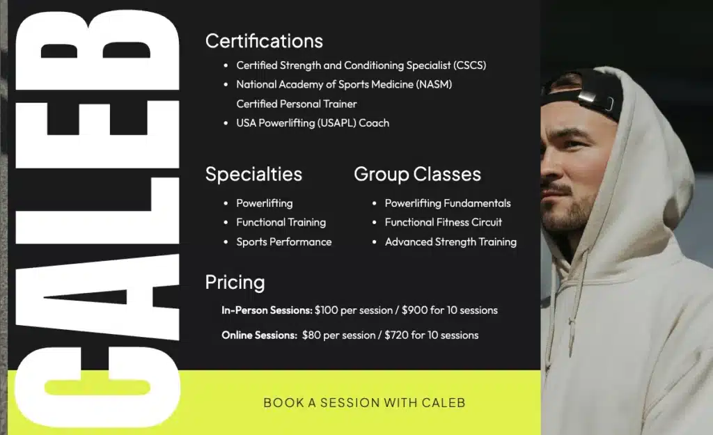
Learn your boundaries and edge ever so closely too them. It will cause people to stop their scroll and engage more with your content AS long as it doesn’t get too crazy.
Don’t Think Top to Bottom…Think In and Out
For a long time websites almost exactly mirrored the print world. Heck even the phrase “above the fold” is a term newspapers used to describe the content above the crease of the morning paper.
But, as time has gone on, creative web designers have realized we don’t have to play by those rules. We can think about websites as a world we step into rather than a piece of paper we scroll up and down.
This is where you can get really creative BUT remember the entire world is accustomed to a website that has a very clear top and very clear bottom to every page.
So, you’re going to have to find unique ways to tip toe toward the edges without going fully overboard if you want the user to perform any type of meaningful action.
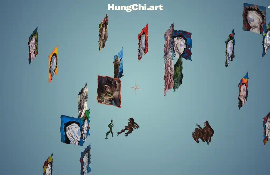
Take this site as an example…when you scroll the images spin around. Then you can click on each to see the piece in more detail:
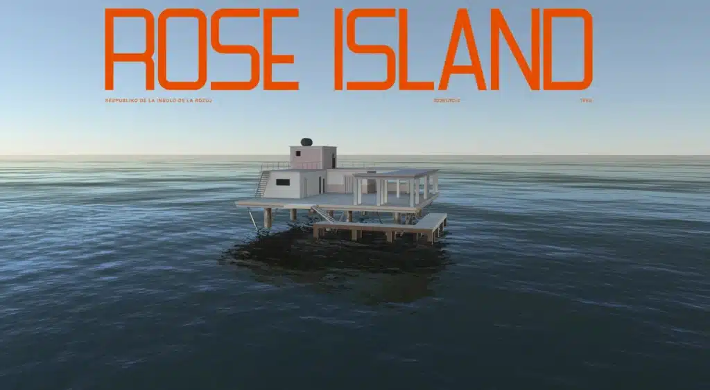
Or this site that pans around a building as you scroll:
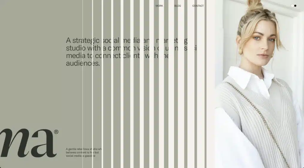
But, you don’t even have to get that crazy in order for it to be considered “creative web design.” You could have sections that scroll horizontally for a little bit like this one:
OR you could very simply add some 3D elements. That helps add a bit of depth to a 2D page and helps the user feel like their in the website rather than viewing it from afar.
I think this creative web design idea is better served as a mindset rather than specific idea. Try to think differently about how someone might interact with your website.
Don’t just assume top to bottom is the best route. Think about it in fun and unique ways that will differentiate you from the other sites out there.
Bring Some Motion
The last little tidbit I’ll offer as a creative web design idea is adding some motion to your site.
This could be in the form of different animations OR it could be simple and subtle little nods here and there.
Make a logo move a little while someone scrolls. Cause the text to move at different paces like they did here:
Or you could just add a little stop motion feel to some of the images like they’ve done here:
Wrapping Up on Creative Web Design
The bigger idea in all of this is you’ve got to be intentional. Don’t just be creative because it’s cool. Think about how it accentuates the main idea of the website
Is it distracting? Or does it help tell the story?
Will someone be more likely to engage? Or will it completely throw them off?
Those are all questions to wrestle with BUT I think it’s worth the wrestle. As time goes on, people will consume websites differently. They’ll think about them differently. They’ll interact with them differently.
So, if you want to stay on the edge of creative web design you’ve got to push your own boundaries a little bit.
Hear me out. I don’t think anything drastic is going to happen any time soon. I know Apple Vision came out and for a while there was a buzz BUT it didn’t totally revolutionize the way we interact with websites.
But, that doesn’t mean it never will. So, while you’re building and growing try to find ways to stand out and be unique.
Who knows. Maybe one day you’ll be setting the trend on the next creative web design practices.

Comments