As 2020 begins to wind down we turn our attention to the newly minted 2021 web design trends.
Okay, there are probably a lot of things you are glad to see go coming out of 2020.
- The coronavirus
- An election year
- The return of fanny packs
And, while there is a lot to celebrate seeing this crazy year in the rearview mirror, we don’t want to be left behind when it comes to the latest web design trends.
Being up-to-date on popular design trends can set you apart as a freelance web designer. It can be the difference between a client hiring you or not.
So, while you’re probably racing to get out of 2020, let’s take a second and think strategically through how to prepare yourself for all of the 2021 web design trends.
1. Flat 3D objects
Around the early 2000s computers began to get more powerful. Designers could actually do some pretty cool stuff with their keyboard and mouse alone!
As a result design realism became all the rage. People tried to make buttons look like actual buttons. Gradients were used heavily to make things look shiny and bubbly.
One of the first adobe photoshop tutorials I went through was how to make a shape look like real metal ??♂️
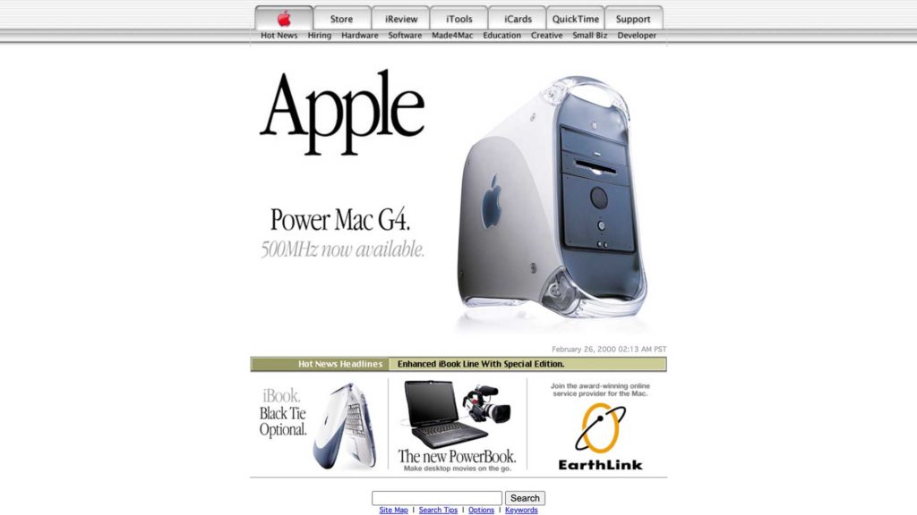
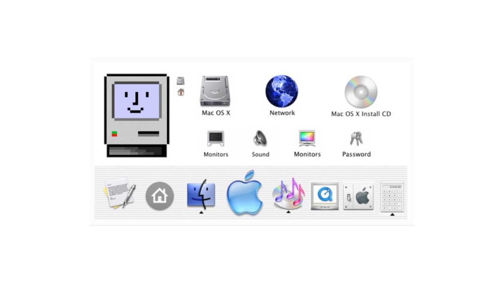
But not too long ago the idea of flat design was introduced.
Flat design was the juxtaposition of design realism. It made things really simple and for lack of a better way to describe it…flat. In other words graphics were 2D and had little or no depth to them.
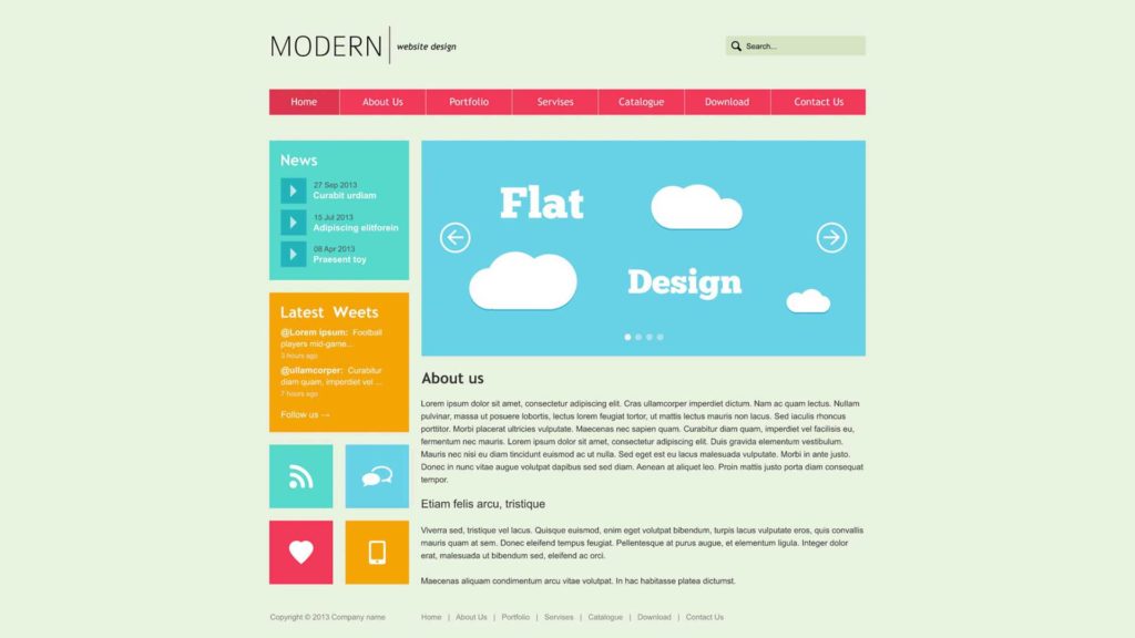
Apple popularized it and everybody jumped on the bandwagon and began to run with it. Flat design has reigned supreme for quite a long time.
However over this last year I’ve began to see a lot of web designers start to introduce more 3D objects into their designs.
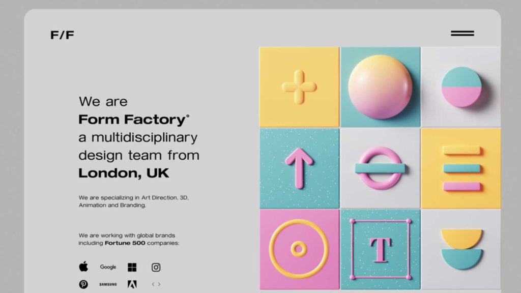
But, these objects don’t carry the realism of those early yesteryears of web design. They are much more artistic. They are much more simple. Sometimes they almost look like cartoons.
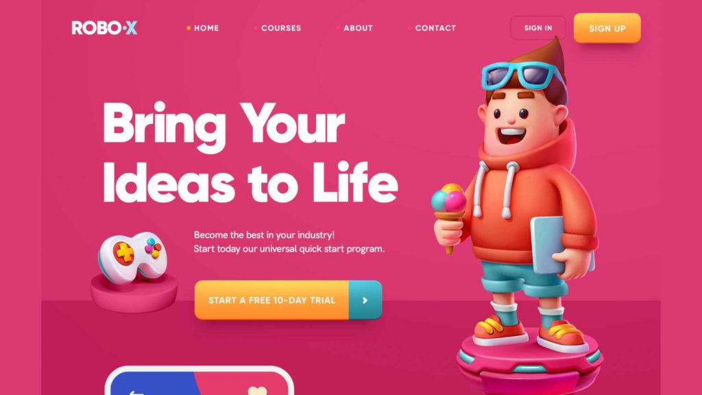
It’s like they’re a mixture of flat and realistic design which is a pretty cool concept.
Now if you’re new to the web design world you’re probably wondering how these folks make these cool 3-D objects.
There’s a cool application called Dimensions that is a part of the Adobe Suite. It’s fairly easy to use and it interacts well with Adobe illustrator and Photoshop. So if you don’t wanna be left behind I encourage you to grab Adobe dimension and start playing around with it there are a ton of good tutorials out there that teach you the basics.
2. Typography Heavy Pages
In years past it was unthinkable to have a website that didn’t have at least one photo per section. But, recently I’ve seen quite a few really cool websites that hardly have any photos or designs outside of the text.
One web design trend for 2021 that I think we’re going to see a lot of is very typography heavy web design. That doesn’t mean that the text is going to be simple or that other design principles won’t be incorporated.
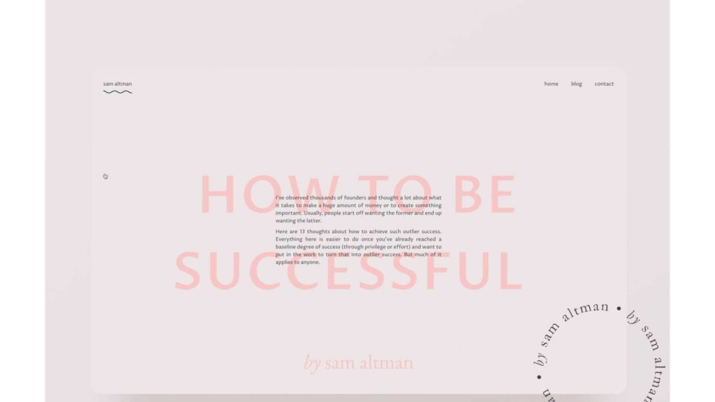
What it means is that a lot of web designers are having a lot of fun using text in new and interesting ways.
They’re trying things out with the shape of the text rather than straight lines there curving things they’re putting things in circles they’re making the text in different shapes.
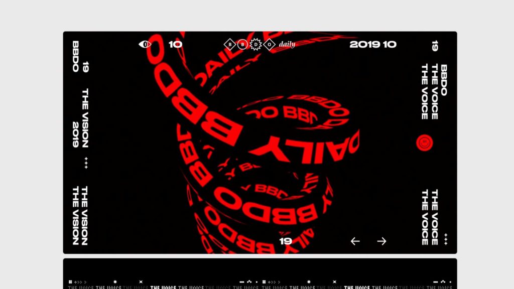
What it means for us as web designers is that we’ve got to pay more attention to things outside of graphic images and photos. We’ve got to think real intentionally about the sizing of our texts and how we can use that to make our web designs more visually interesteing.
Some good practice would be to challenge yourself to build a landing page that is visually interesting using only typogoraphy.
3. Two Extremes
Another trend I’m seeing in web design for 2021 is what I like to call the extremes. What that means is is a lot of web designers are choosing one extreme or the other.
They’re either taking the designs super minimal or super maximal. So some webpages you hardly see any text or any photos. There’s more blank space than there is anything else.
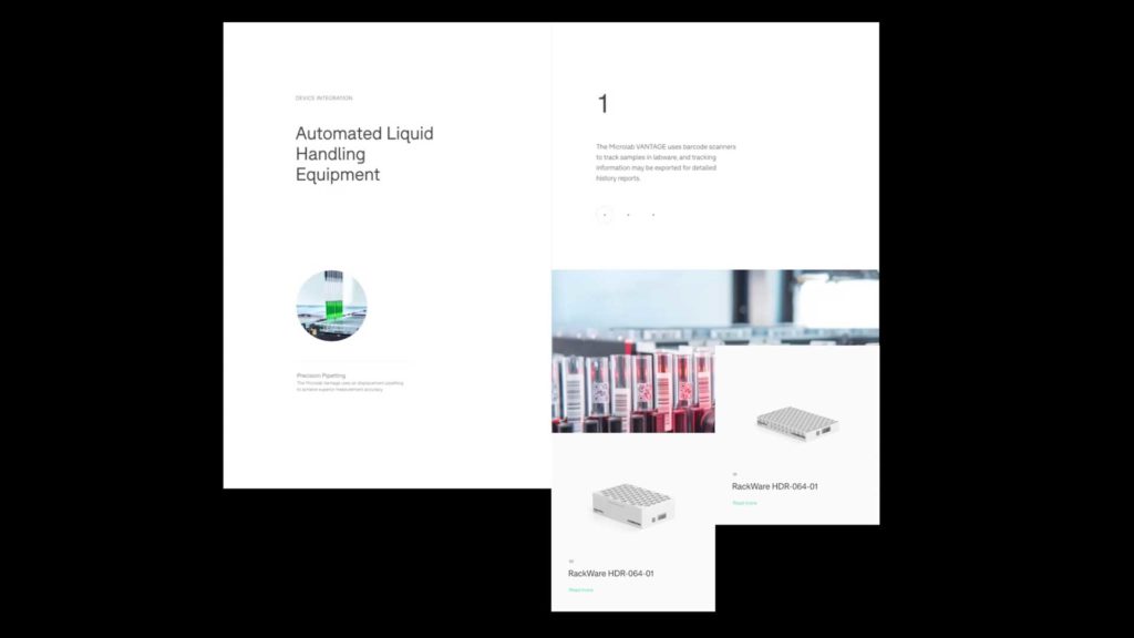
Other websites feel crowded with the number of images and text and animations they have. They might feel chaotic but every design decision is done intentionally.
There is a lot of movement and hardly any pattern is repeated twice. Amongst all of the 2021 web design trends, this one is one of my favorite.
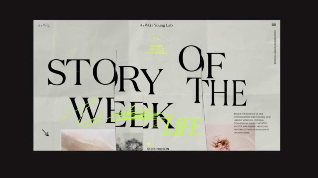
These two extremes leave web designers with a lot of opportunity to experiment and try things out. After a while a lot of web designs feel very similar. BUT, with these trends in your pocket you’ve got a chance to go outside of the box and liven things up.
4. Accessibility
One important topic that will continue to be an important issue amongst 2021 web design trends is the issue of accessibility.
If your unfamiliar with the term, accessibility in web design is creating a site, app or software etc. in such a way that someone with a disability would be able to easily use or navigate through it.
Accessibility is thinking about your web design from the perspective of someone who is visually impaired or may be physically handicapped.
To be honest, accessibility shouldn’t be a trend. It should be something we as web designers do all of the time whether or not it’s a hot button issue.
But, thankfully, as awareness increases around accessibility on the internet so will our need to think about what we put on the web from the point of view of every possible user.
There are a couple of great resources for accessibility on the web. The first is the mother of all WWW’s w3.org.
The other is from ada.gov.
5. Mixed Media
Another really cool trend among the top 2021 web design trends is the use of mixed media.
Mixed media has been around for a while. It goes all the way back to 1912. It’s been used even by great artists like Pablo Picasso.
The core concept is simply to mix any kind of elements together to make art or design. You’ll find photos with paint on it OR different photos cut out and put together.
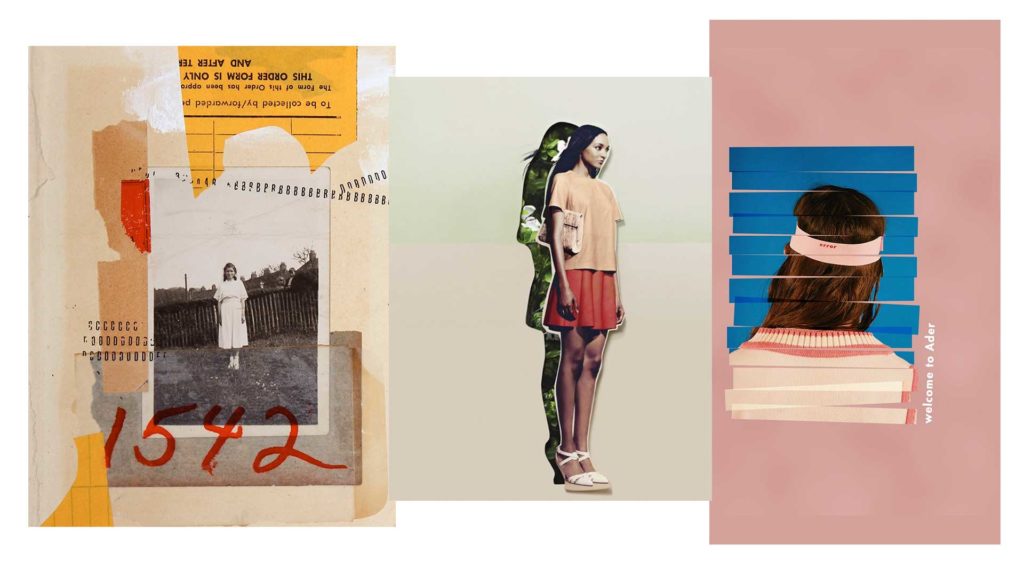
Web designers didn’t take it quite as far as a lot of mixed media artists do. Mixed media is used much more subtly in the world wide web.
You’ll see real images mixed with graphic elements OR people cropped out of photos and surrounded by shapes.
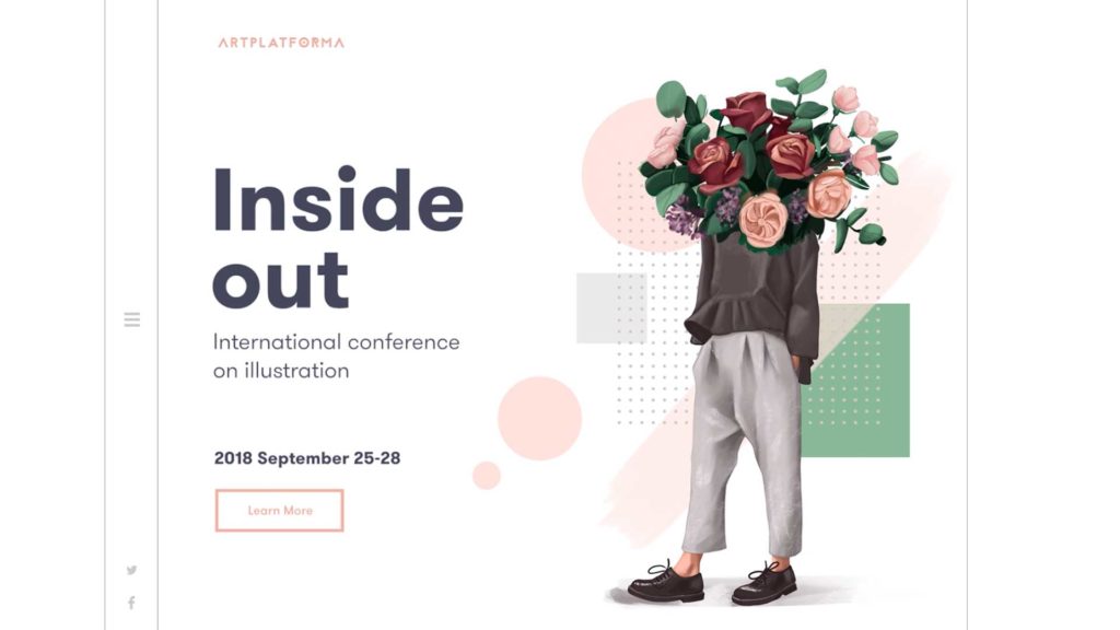
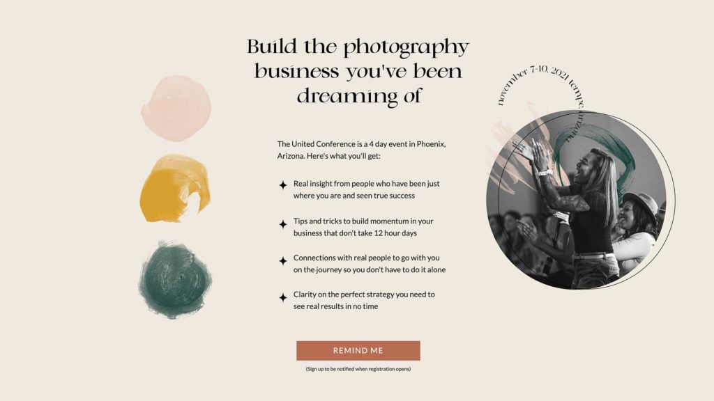
This is one of those 2021 web design trends that requires some skills in the graphic design category. You’ll need to know your way around something like photoshop OR AT LEAST be patient enough to crop out the background of images so you can add some other elements on top of it.
Either way this is a fun trend I see popping up more and more and I can’t wait to see where it goes.
6. Bauhaus Patterns
Another one of the 2021 web design trends I’m seeing pop up more and more is Bauhaus patterns.
The Bauhaus movement actually came from a design school in Germany called The Bauhaus School. It was founded in 1912 and has had an incredible impact on the design community as a whole.
Something from the school that is starting to pick up speed is the use of Bauhaus patterns and shapes.
Bauhaus patterns are typically geometric shapes that are pieced together like patchwork. They have bright complimentary colors and are really fun to look at.
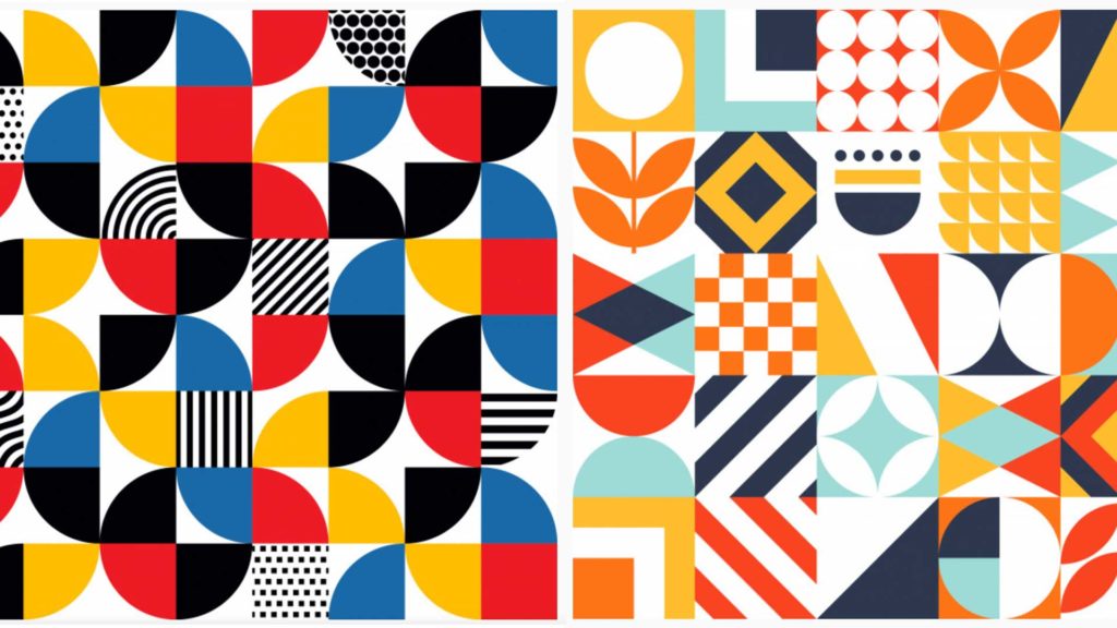
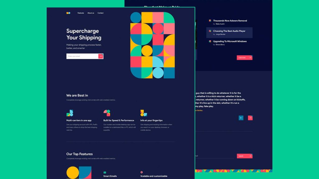
Web designers are using these shapes in all sorts of ways. The varied colors and patterns add a level of texture to the design and can bring visual interest without having the need to have really great photos.
Which as many web designers know it’s sometimes tough to get good photos from clients and you’re forced to use stock images.
Use these shapes to add dimension to a web page and bring attention to an area you’re wanting the user to focus on.
2021 Web Design Trends
Wherever you find yourself in your web design journey, it’s important to know where the trends are heading.
It helps us as web designers know what clients are seeing and what they’re comparing their sites too. It also gives us something to aim for in creativity.
It’s not always possible to incorporate the latest designs into a project and that’s okay. Your first goal is to serve your client BUT after that it’s important to stretch yourself creatively.
And one way to do that is to keep up with the 2021 web design trends.
Who knows, maybe one day you’ll be the one setting the trends and some guy who has a podcast or blog will be talking about you ?
I’m starting to practice the use of mixed media more in the websites I design, definitely one of my web design aims for 2021! Great article as always! <3
Yeah, awesome! I just started dipping my toes in that as well.
Great article!
Thanks, Josh! Glad you liked it.