“I need you to make my website more modern.”
I hear that all the time as a freelance web designer.
The problem is the phrase “modern web design” is pretty elusive.
It’s elusive in the sense that it’s always changing. If you’re not careful your go-to moves for making your web design more modern becomes a thing of the past.
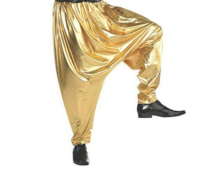
It’s like showing up to school in parachute pants only to realize you’re a decade too late! Any M.C. Hammer fans? Just Me?
That’s why it’s so important to become a student of good web design.
You have to make sure that you’re seeing trends before they come and staying slightly ahead of the curve.
It’s also elusive in the sense that “modern” could mean a lot of different things to a lot of different people.
Aunt Betty might think she’s got a super modern living room set she found for a steal at a garage sale but when you walk in all you can think of are movies you saw in the 90’s.
If you’re not careful, you could spend a lot of time and effort making a client’s site more modern only to realize you didn’t hit THEIR definition of modern and you’ve got to go back to the drawing board.
That’s why it’s super important to have a few things up your sleeve to show a client that don’t take you hours and hours to finish.
So, the sweet spot for things you can do to make your web design more modern are things you can do that are actually CURRENT and also SIMPLE to accomplish.
current + simple = ???
Thankfully, there are a few things that are INCREDIBLY SIMPLE that pass our test for making your web design more modern.
Here are my go-to moves.
1. Letter Spacing
Letter Spacing is one of the easiest ways to make your web design feel more modern.
In the web design world Letter Spacing, also called tracking, is the distance between each letter in a word.
Often times the header tags in a page will have at least a few pixels between them.
When I see spacing that I like I’ll often inspect it in google chrome’s developer tools to see what they’ve done.
In the CSS world, letter spacing is super easy to accomplish
element {
    letter-spacing: 2px;
}
BUT, be careful, you don’t want to overdo things unless you’re trying to be super creative. At a certain point letter spacing starts looking tacky.
So, use discretion but it’s fairly safe to say a couple of pixels of letter-spacing wouldn’t hurt anyone.
2. Rectangles
Rectangles are all the rage these days. And, the best news is it’s easy to implement them in any web design.
A lot of times I’ll use them as a design element to fill a space that feels a bit to empty.
You can use them behind a photo to add some flair or just for fun next to text.
Typically, the rectangle will be off-centered from an object that holds the weight of the page. It’s fun to get creative with placement and figure out different positions outside of the normal 10 pixels up and to the left.
I often use a before or after pseudo-class to accomplish this to try and keep my html semantic. It’s not good practice to have an element that’s just a rectangle for design purposes.
The CSS will typically look something like this:
element {
    position: relative;
}

element:before {
    content: '';
    background: #000;
    width: 100%;
    height: 100%;
    position: absolute;
    top: -10px;
    left: -10px;
    display: block;
    z-index: -1;
}
3. White Space
White space is like the California real estate of modern web design these days. It’s worth A LOT.
Like actual California real estate, it’s probably over-priced but that argument is for another day.
White space as a concept is pretty simple. BUT, when you’re first getting started it’s super tempting to try and fill as much space as you can with as much design as you can.
Dieter Rams is a pretty famous product designer. He’s made some pretty iconic products for company’s like Braun and Vitsœ (think really expensive Ikea).
He’s also written some pretty influential books on design. The titles:
It’s easy to tell from the titles that he is a fan of white space.
Our world is so crowded with messages that you can make a pretty big modern statement in your web design with good use of white space.
When you’re trying to make your web design more modern don’t start with the question: “What can I add to this section?”
Rather start with “What can I take away from this section?”
Of course, stop before you get to a website that has nothing but blank pages. That’s as silly as a duct-taped banana worth thousands of dollars.
4. Font Combos
A good font combo can really improve the modern feel of any website.
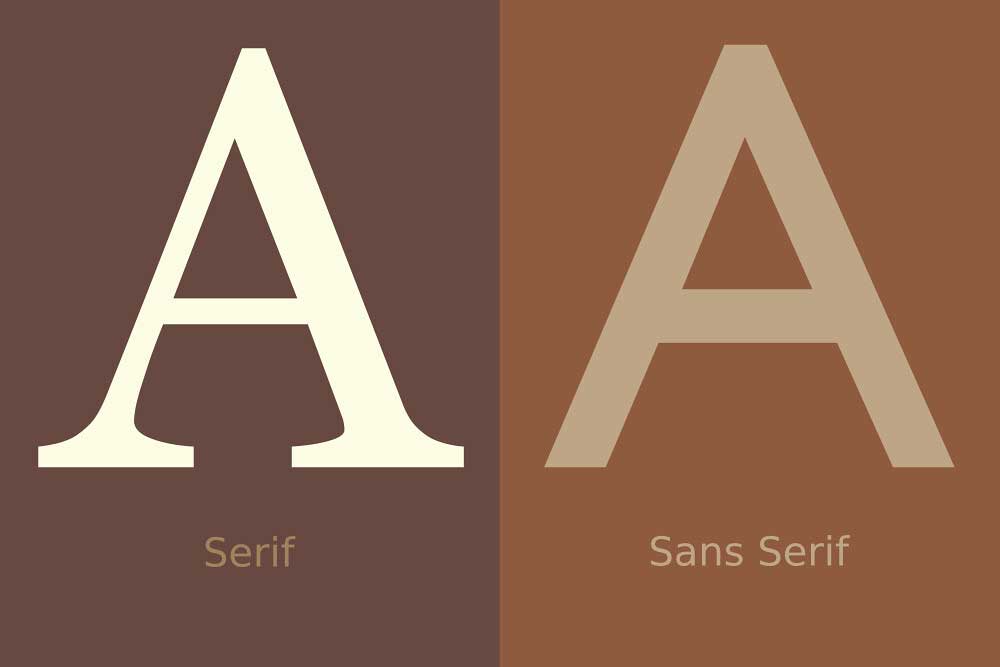
It wasn’t long ago that in order to be modern you had to stay away from all Serif fonts. But, that’s not true today.
There are plenty of web designers that make things more modern with all sorts of fonts including Serif, Script and even Black Letter.
In case you need a refresher, serif fonts have a bit of style added to their ends while san-serif fonts are straight and clean.
The fonts I choose for each project have much more to do with the branding of the company or organization I’m building the site for.
But, I often use font pairings to create some visual interest that keeps the user engaged throughout the site.
I recently looked up how much of the page our users were scrolling through on the Showit.co site and found that 50% of our users weren’t making it past the top 15% of each page.
Text typically makes up the majority of the space on every web page. So, if you’re not doing something to keep users engaged along the journey with your fonts it won’t matter how awesome everything else looks.
a few of my go-to font pairings are:
A good site to look through and get inspiration is fontpair.co
5. Good Images
Not all images are created equal.
In fact, some absolutely scream BAD STOCK PHOTO.
To be clear, I’m always a fan of having a client do a photoshoot for their site. Nothing will capture the heart and personality of a company like getting pictures of the people that run it.
BUT, it’s not always possible. That’s when we turn to stock photos to help us.
The best way to visualize photos that are more modern versus photos that date a site is to see an example of a good photo and a bad photo.

Let’s point out some differences between the two.
Staged vs. Natural
First, the models in the dated photo look like they’re at a photo shoot. It’s like you can see in their eyes that they realize a camera is taking their picture.
While the modern photo looks like two people were having a conversation at work and someone just happened to have a camera when they were walking by.
You want photos to feel less like a staged shoot and have more of a photojournalistic feel.
Trendy Clothes
You’ll also notice that in the dated photo the model’s clothes are out of style. If you dress like them I’m not trying to hurt your feelings.
But, as a web designer you’ve got to know how to be objective about what you’re looking at even if it’s not something you like personally.
The color of the clothes on the dated models are NOT on-trend and neither are really big white collars ?
As opposed to the modern photo that has some great colors and the fit of the clothes are much more in line with what you’d see in the trendiest stores at the mall.
Photo Editing
Finally, you’ll notice that the photos are edited much differently in the dated example versus the modern example.
In the dated example everything feels really sterile but in the modern example a lot of elements are exaggerated and dramatic.
Take the light coming through the window. In the modern photo it’s glaring but in the dated photo there’s no glare at all.
The modern photo has exaggerated shadows and depth of field while the dated photo has neither.
There’s also a noticeable color tone to the modern photo while the dated photo has a real balanced white tone.
Not every modern photo will have all of the same elements and of course, there are plenty of reasons to break the rules. BUT, if you stick to these general guidelines you’ll be safe.
A few trusted resources for photos that have a modern feel and are 100% royalty-free are:
6. Duotone
A type of editing style done on photos that need a category all their own when trying to make your web design more modern is something called Duotone.
At it’s simplest form Duotone is taking all of the colors out of an image and laying 2 different colors as masks on top of the image and blending them in.
Duo meaning two. So, two tones on one image.
With the CSS mix-blend-mode property it’s easy to accomplish this without using a photo editor.
Let’s use our modern photo example to show you how it’s done

Thanks to Jose Perez for this neat trick.
In order to get this effect in CSS, all you have to do is add an image to the background of a container and then add a before and after pseudo-class to the image with blend-color-modes both lighten and darken respectively on those pseudo-classes.
It’s fun to play around with different colors and see how they work together. You can see my pen here:
See the Pen Duotone effect – Using CSS Blend Modes by Chris Misterek (@chrismisterek) on CodePen.
7. Lines
The final way to make your web design more modern is to add some lines.
I love lines. They’re so easy to use and yet can spruce up just about any design out there. There’s no hard and fast rule about how long they should be or what direction they should run.
BUT, just like the rectangles, it’s nice to try and put them in places that are a bit asymmetrical or off the beaten path.
I also use pseudo-classes to display these as not to mess with any semantics on the page.
You’ll even notice some lines here on Self-Made Web Designer in the background of the pages. Nice and subtle but still making the web design a bit more modern.
Wrapping Up
After all is said and done, it doesn’t take a lot to make your web design more modern. When clients ask me in the initial stages what my plan would be to make their website more modern these are typically the things I suggest.
But, it’s important to keep up with the latest trends. Eventually, these go-to moves will no longer be modern.
So, what do you think is next? What type of things do you do to make your web design more modern?
Leave a Reply
This free, 4 video course will give you all the tools you need to start freelancing as a web designer & earning extra money.
• How to get started from scratch
• How to find your first clients
• How to charge higher rates
Become a web designer and land high-paying clients

